
Project Case III
Miig Wech
This project is an activewear and miscellaneous goods store design that responds to the multifaceted lifestyle of modern people who move between the city and nature. In terms of location, it is located in a vibrant city centre where various age groups and occupations coexist, with a complex business district and two universities nearby.
Considering these location conditions, the design focused on the needs of modern people who long for a connection with nature even in their busy city lives. The design concept aims to create a space that flexibly crosses the boundaries between daily life and outdoor activities. This allows customers visiting the store to experience a natural transition between daily and outdoor life and effectively conveys the brand’s identity.
Details
1 Floor, 2 Spaces
2016 / Seoul, Korea
Urban Active-wear Retail Shop
")
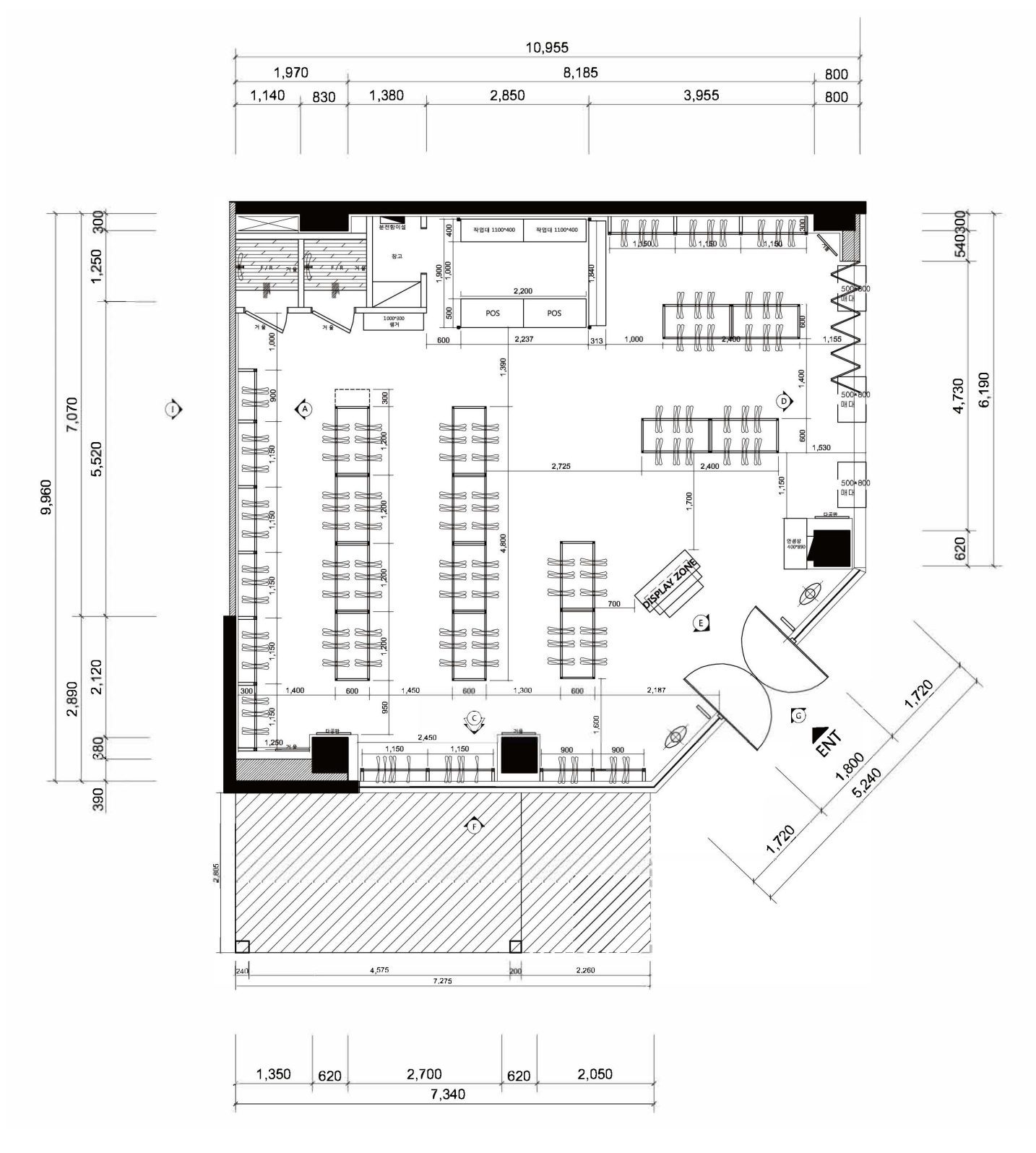
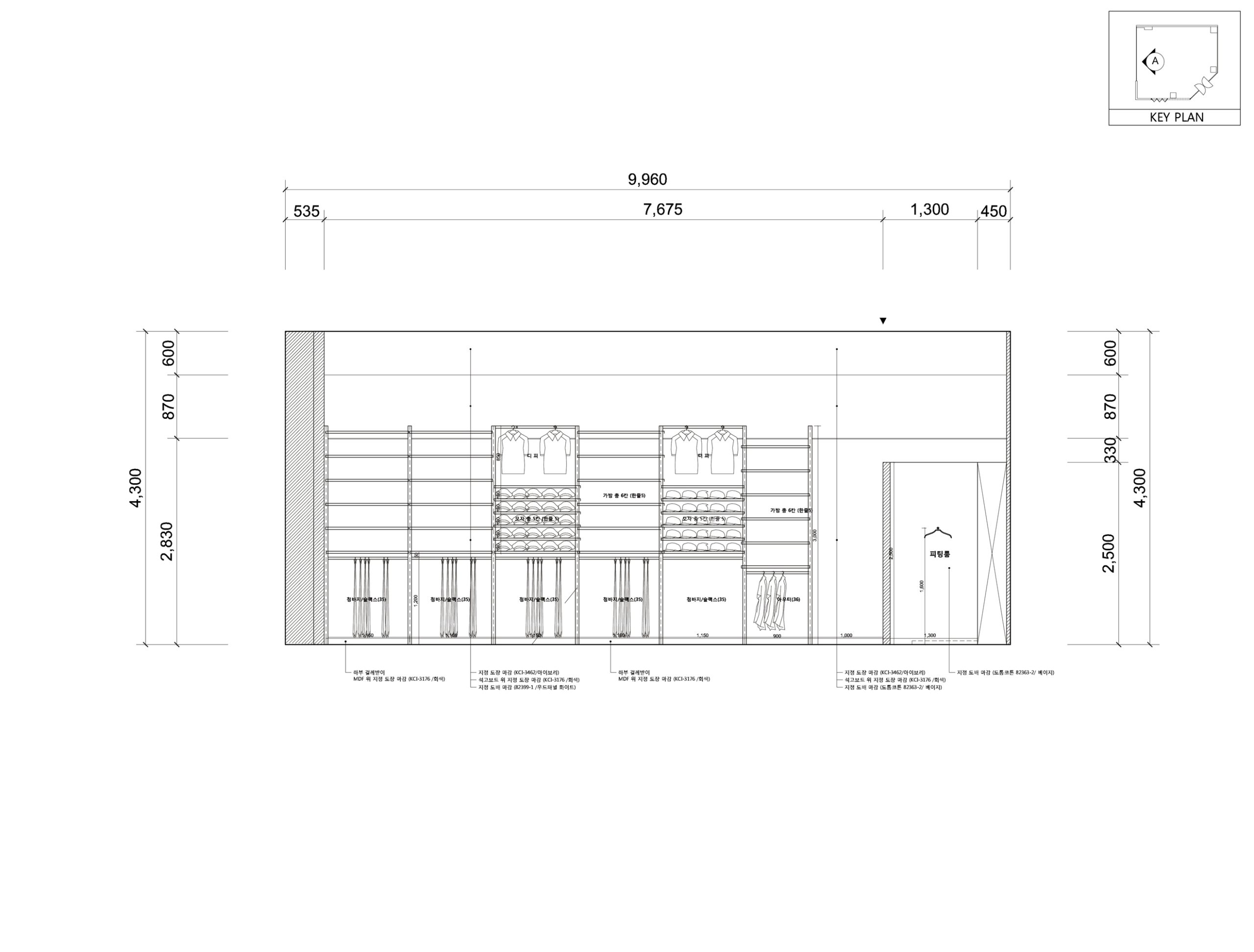
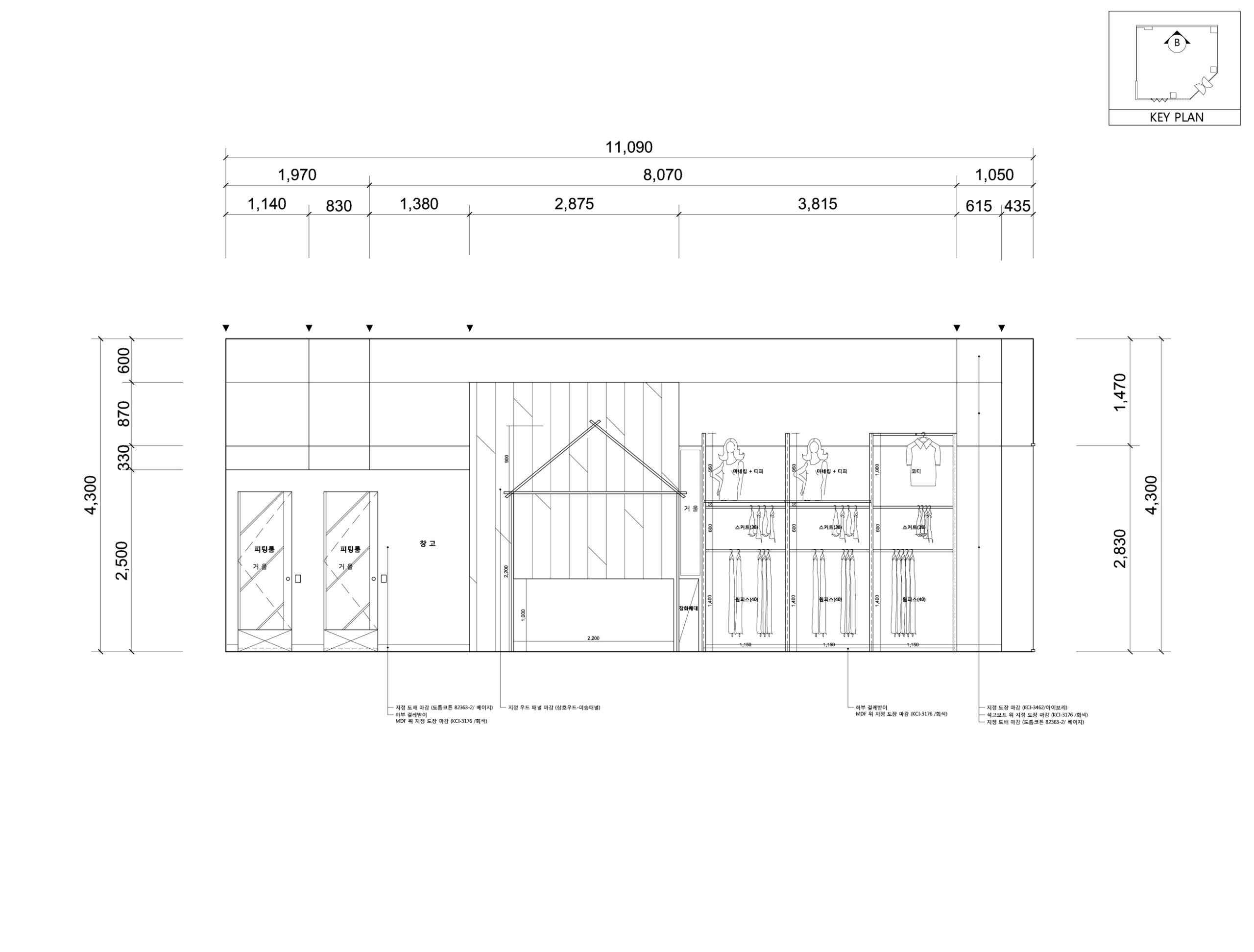
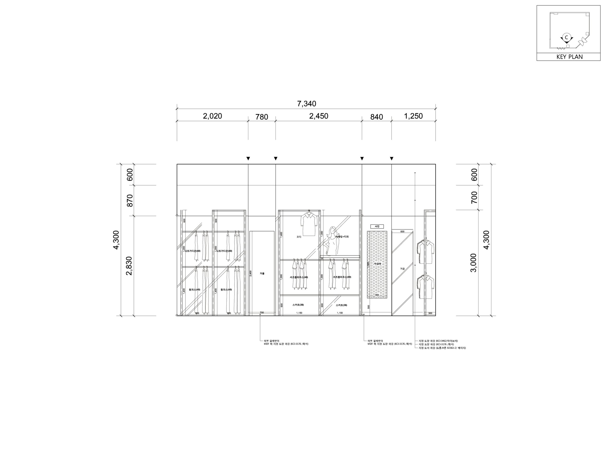
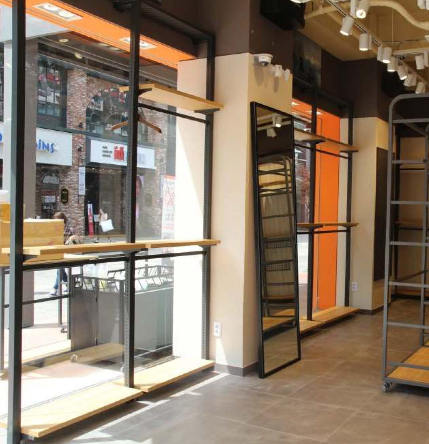
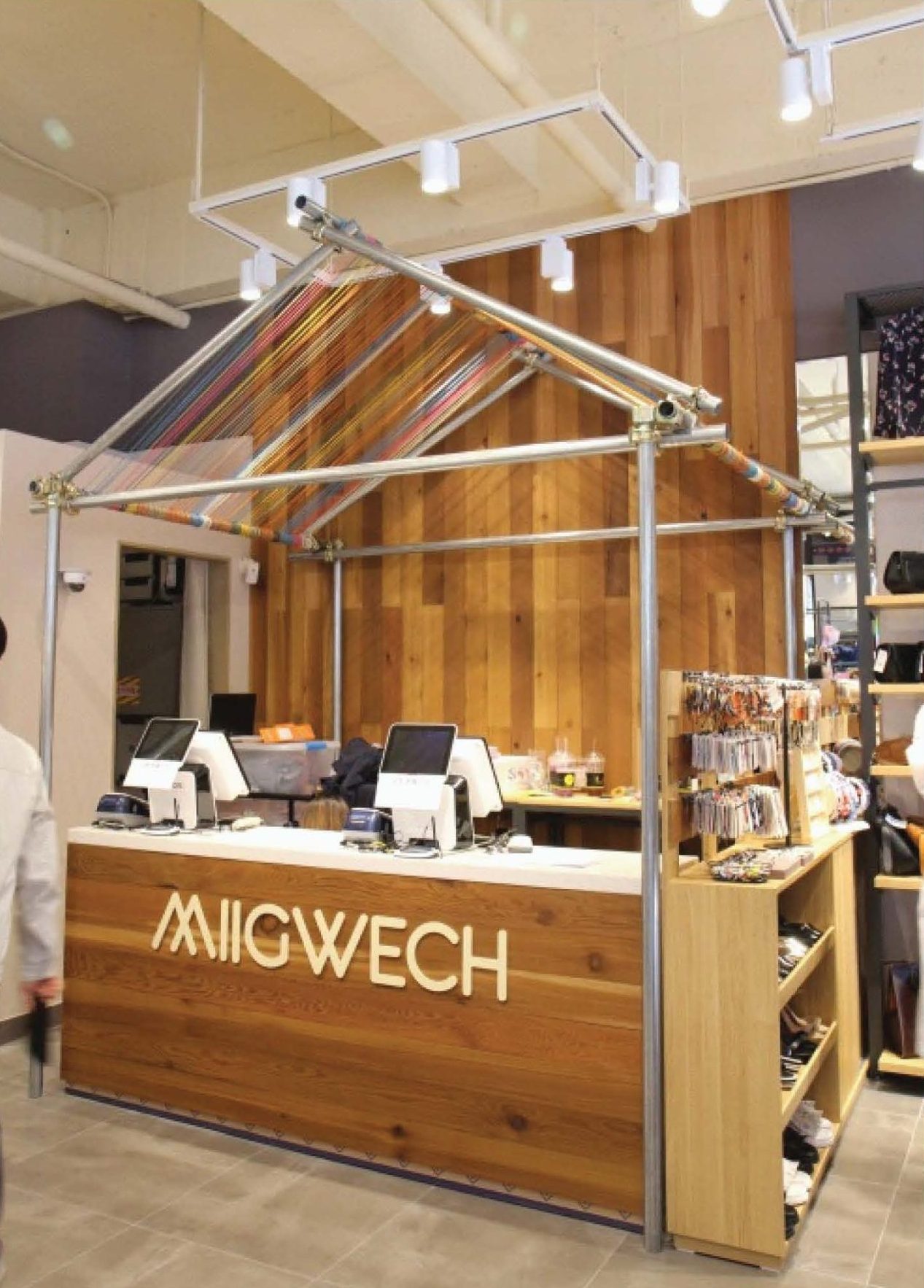
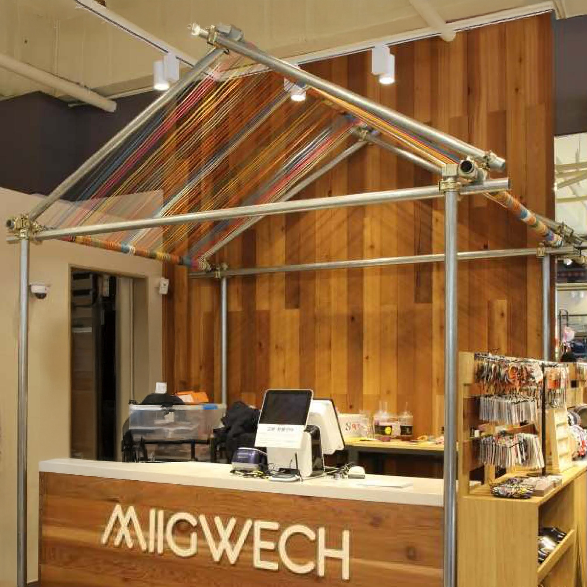
Interior Detail
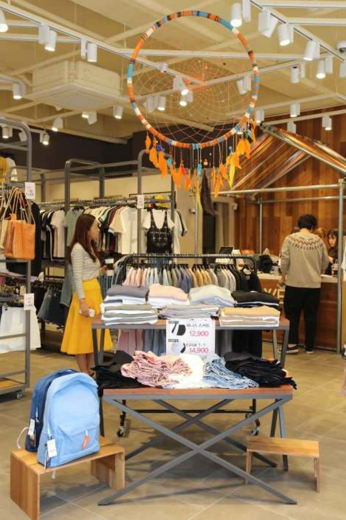
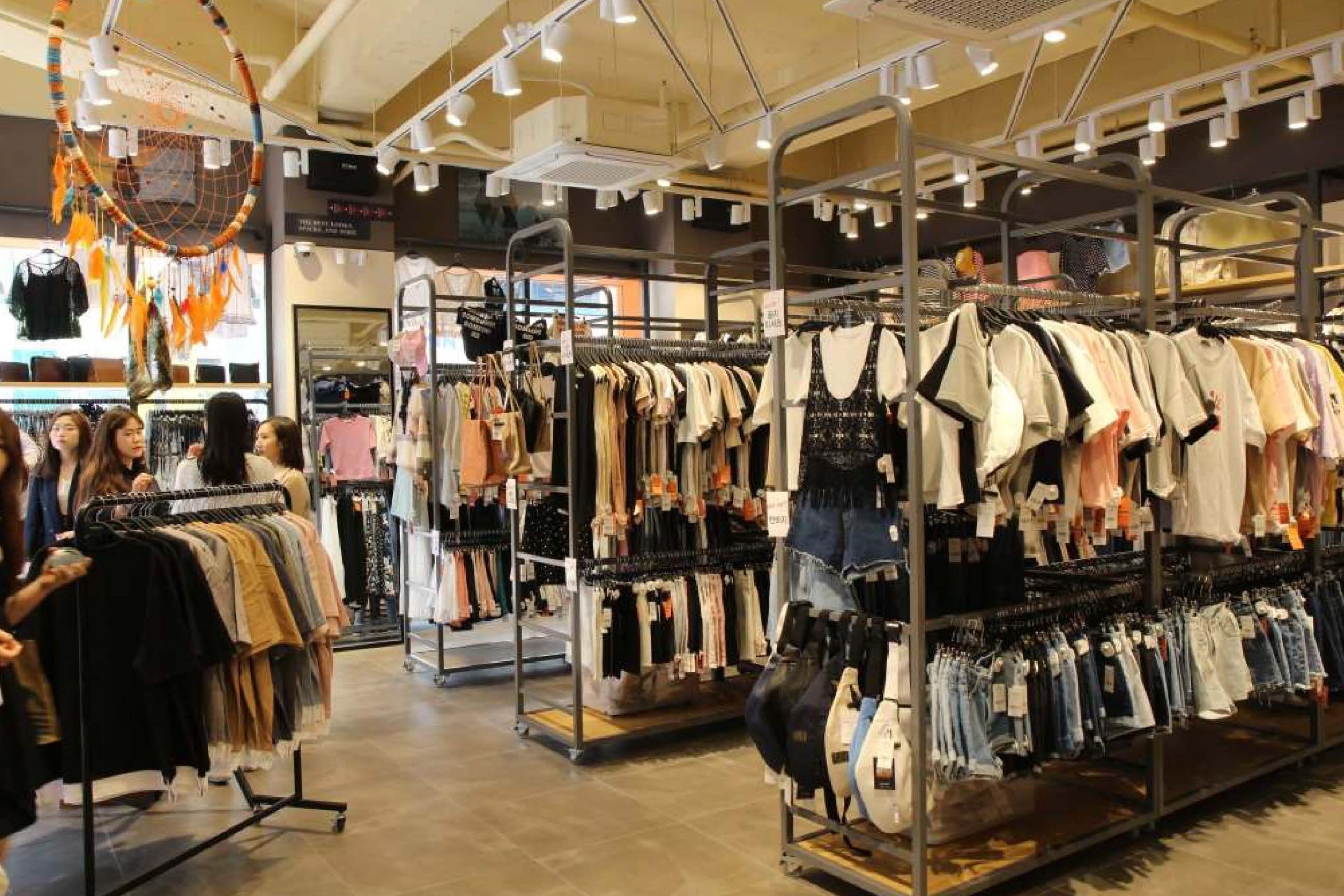
The products presented in this store are comfortable yet functional clothing and miscellaneous goods, so the pipe structure, which indirectly symbolizes climbing and mountaineering, was chosen as the core element of the place to present an active and dynamic display at the same time. In addition, the shape of the fixed metal hangers, and the metal frames installed above the cash register emphasize the brand identity and provide practicality as the use of visual merchandise.
The hanging installations, the interior decoration, seem like the shape of a gem; it indirectly expresses the new changes and vitality that can be encountered in outdoor activities with plants placed together.
")
Integrating Outdoor Culture into Everyday Life
Wood and iron were appropriately used in selecting materials to naturally incorporate the concept of ‘outdoor culture in everyday life’. In addition, decorations using colourful threads and ropes symbolize the positive energy and experiences gained from a lively daily life.
This holistic approach goes beyond simple product display and provides customers with a deep brand experience.


Symbolic Structures
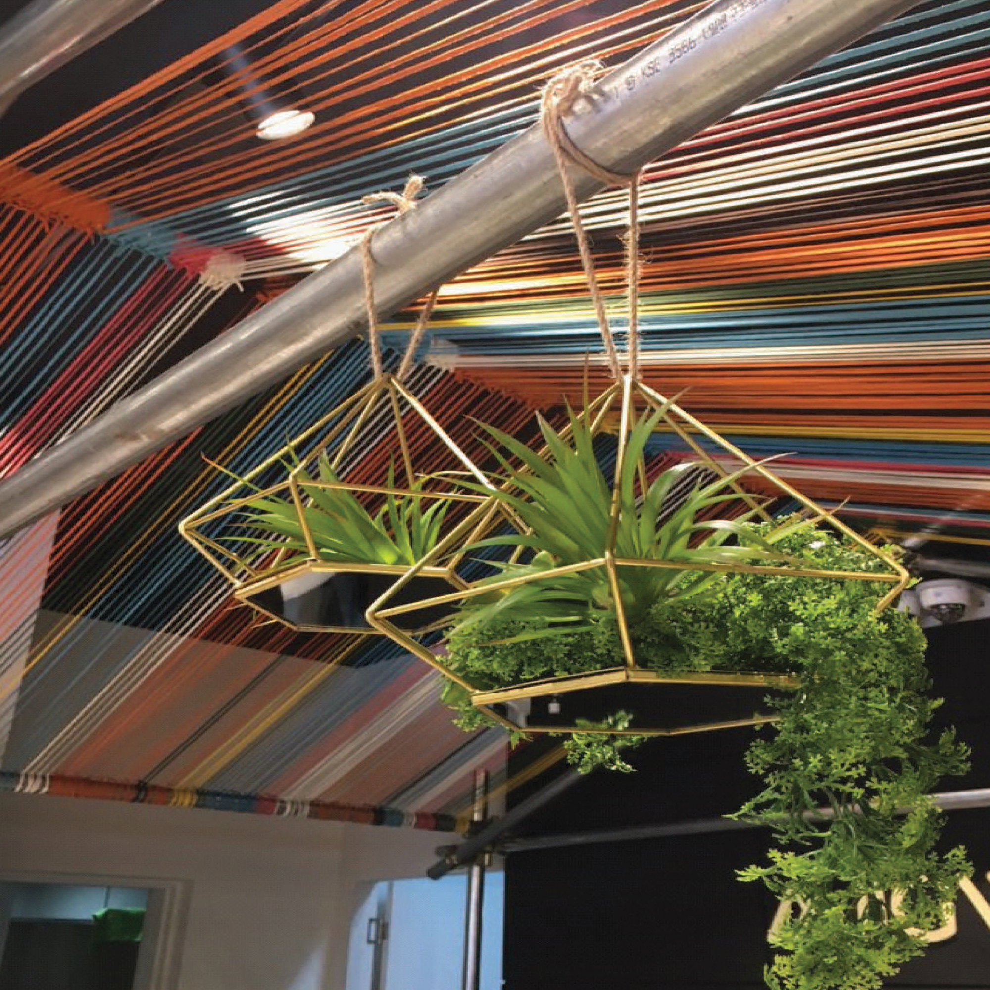
Hanging Plants
For the interior decoration, hanging structures abstracting the shapes of gems, stones, and minerals were combined with plant displays, allowing city people to indirectly experience the hidden aspects of nature that they can encounter during outdoor activities such as running, hiking, and trekking.
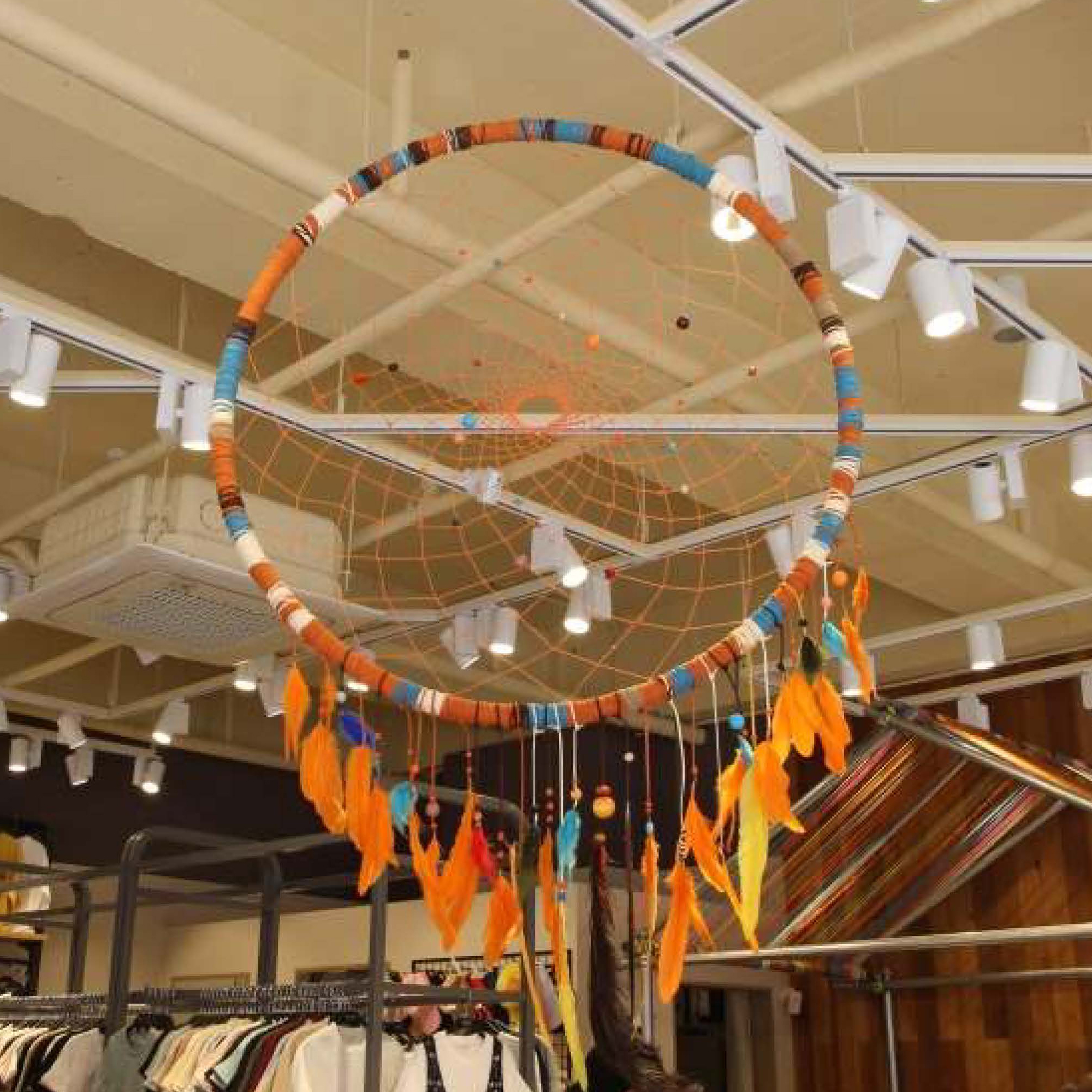
Colorful Ropes
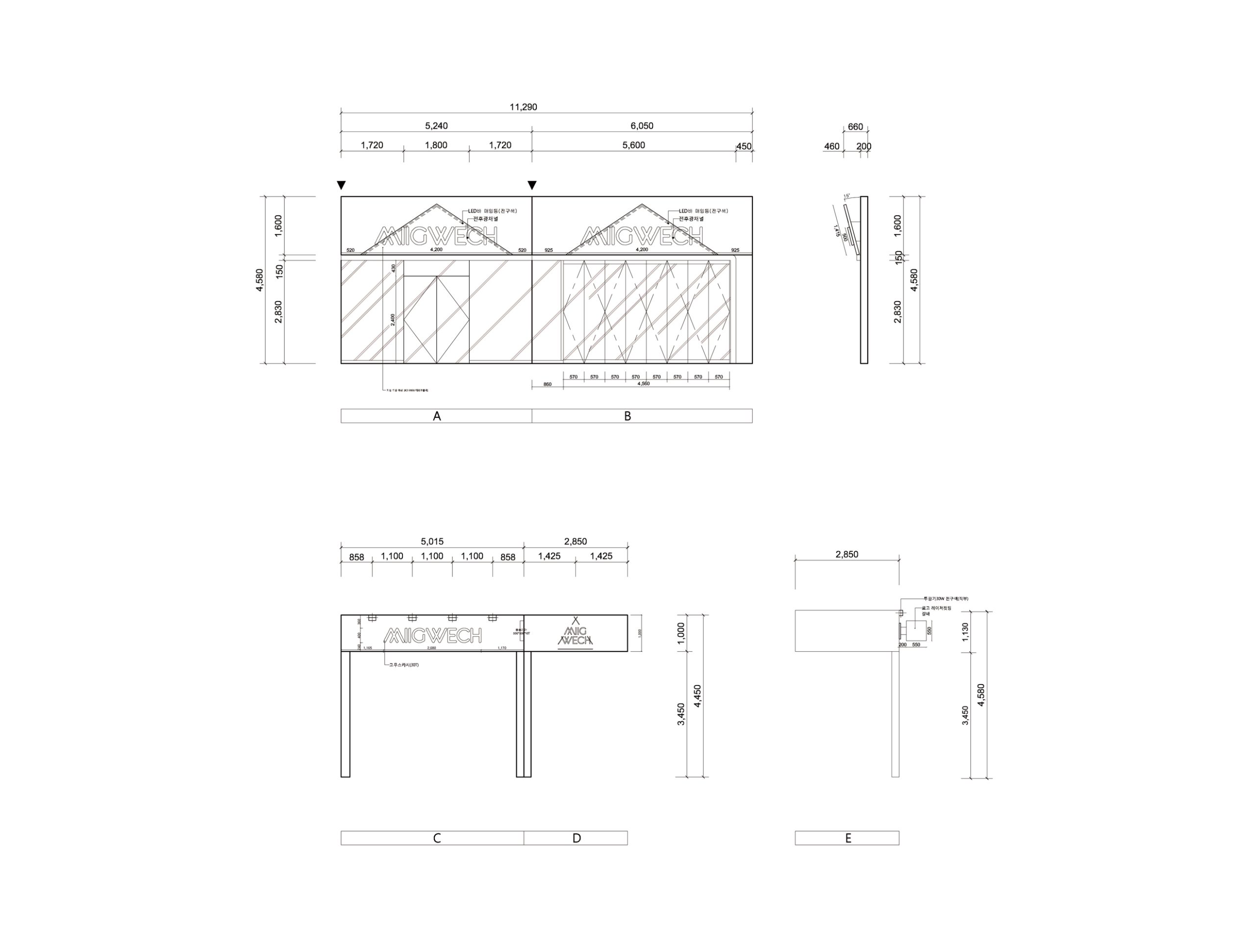
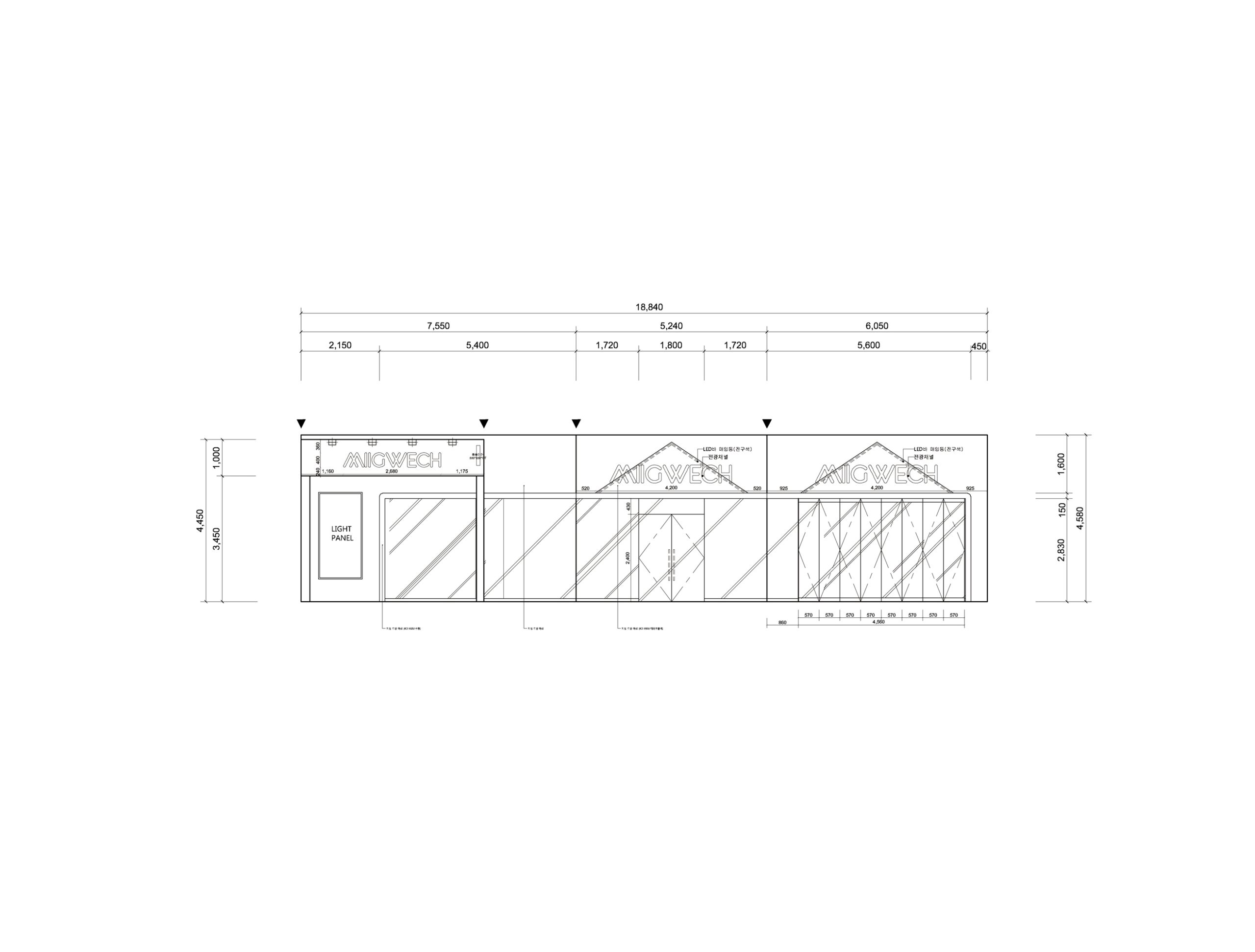
Facade Detail
In the façade design, the focus was on visual impact through contrast and effective delivery of brand identity. By selecting black and orange as the main colours to create a strong contrast, attention was increased on streets with a lot of traffic. At the same time, a triangle symbol reminiscent of a tent or mountain was placed behind the brand name to visually express the image of outdoor activities.
A large flag was placed on the top of the floating structure near the main entrance. This is reminiscent of the symbolic flag of an outdoor activity crew and naturally attracts the attention of customers who seek a sports urban outfit. These elements effectively convey the identity of the store and the content that the space is intended to provide.
")
")
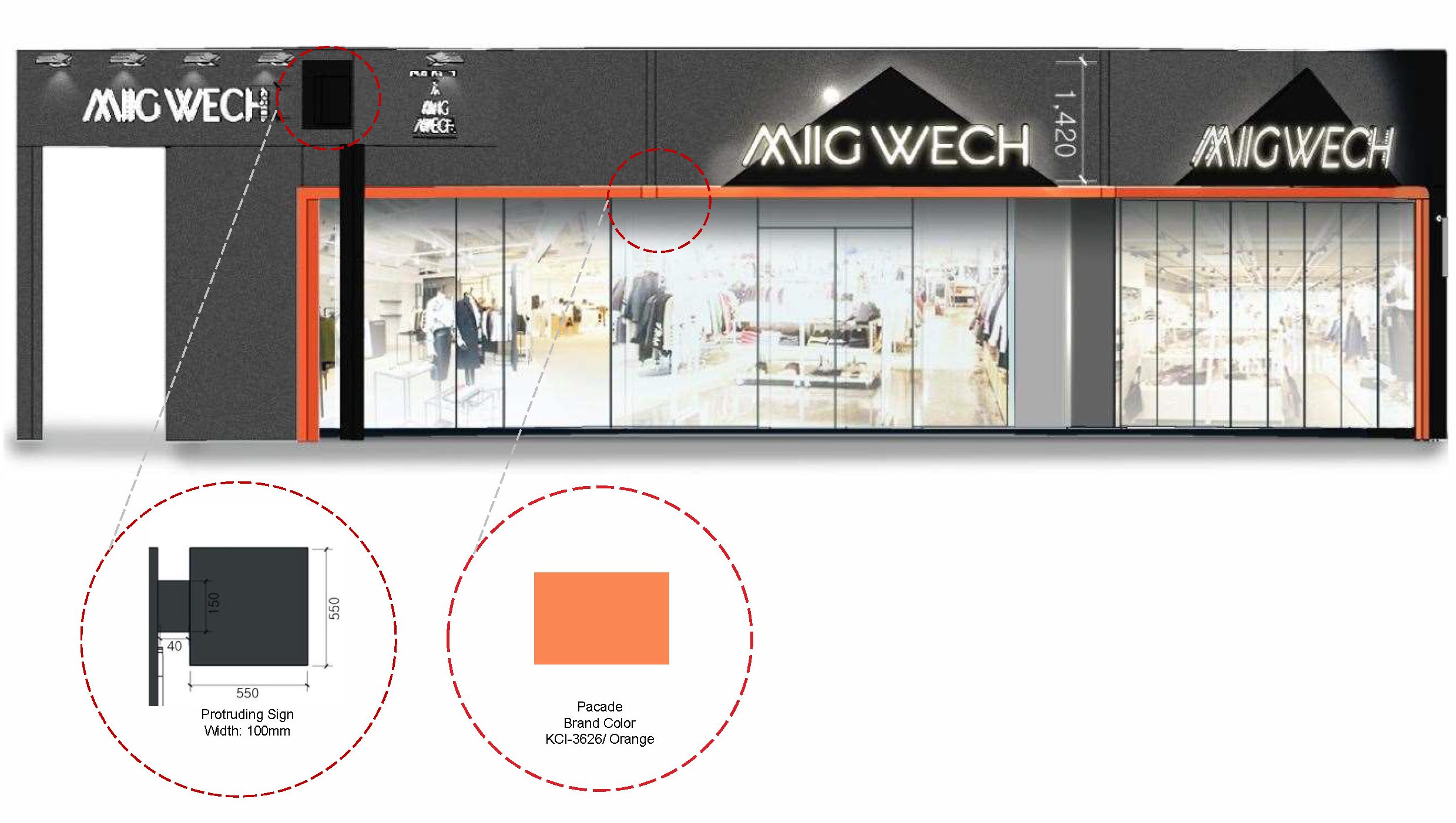
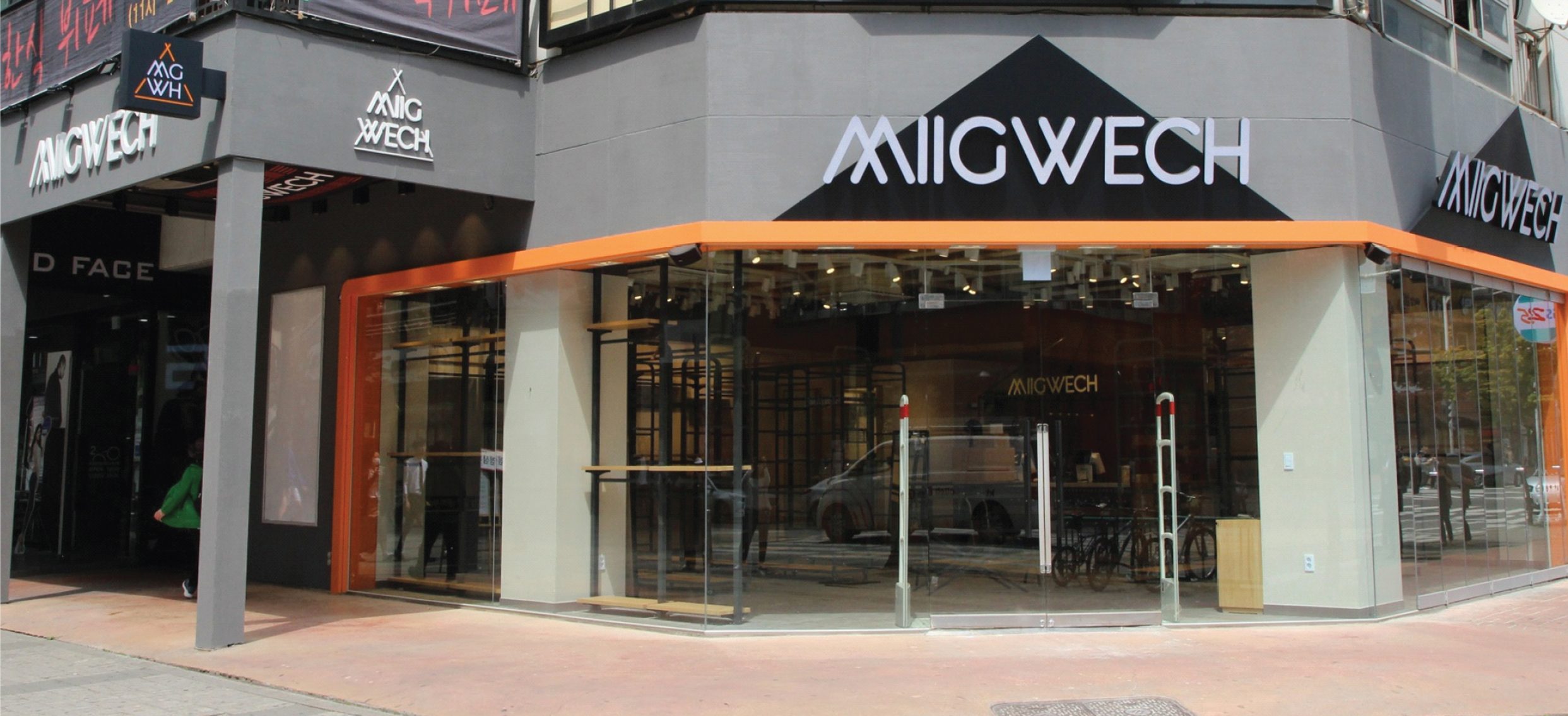
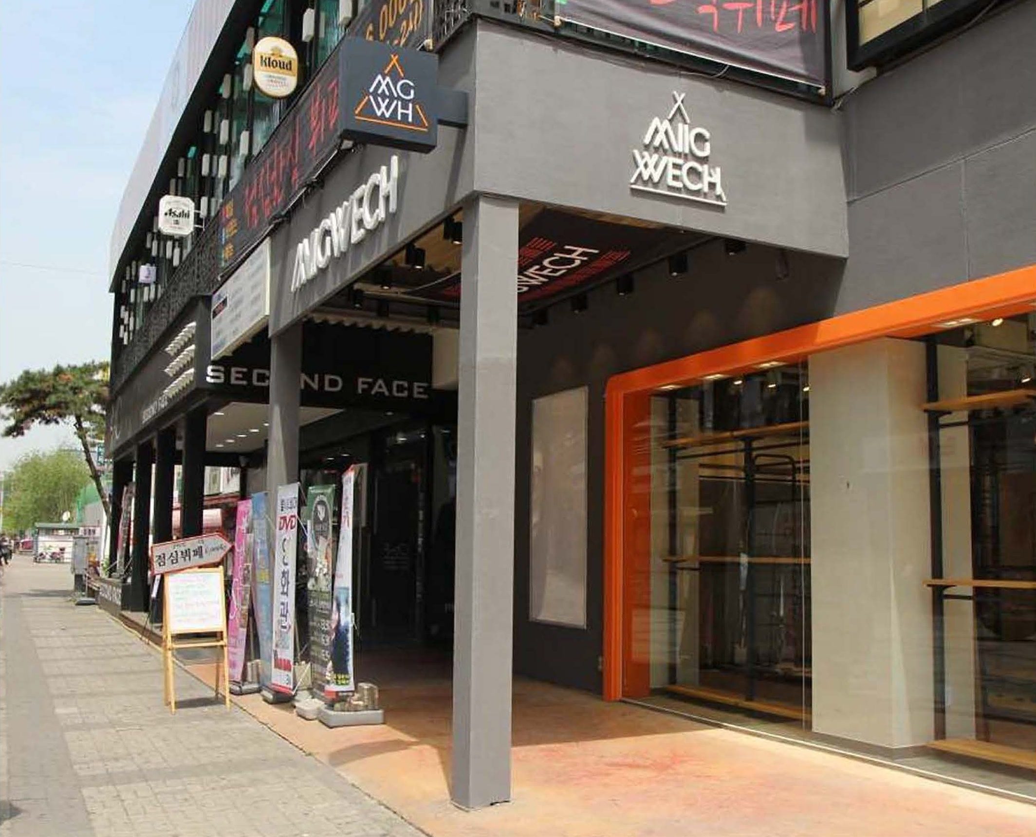
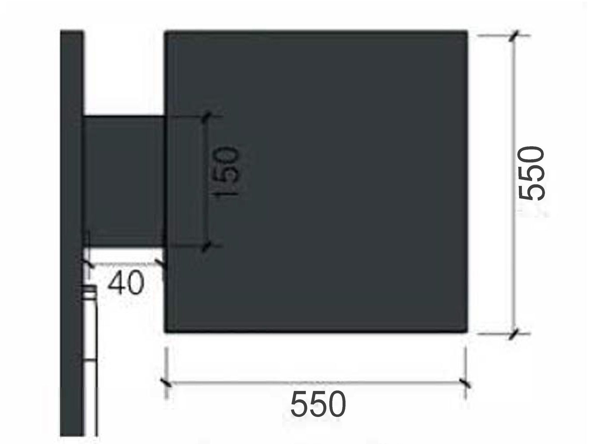
Protruding Sign
The 100mm protruding signboard fixed to the piloti structure adjacent to the main entrance strategically placed elements that maximize visual attention, considering the store location with a high floating population.
The façade and protruding signboard secure a wide area, naturally attracting the attention of pedestrians.

Brand Colour
The orange colour (KCI-3626), which was adopted as the main colour considering psychological and symbolic meaning, symbolizes vitality and adventure, which is consistent with the brand’s active image.
By contrasting it with black, it creates visual tension and at the same time has a striking presence in the surrounding environment.
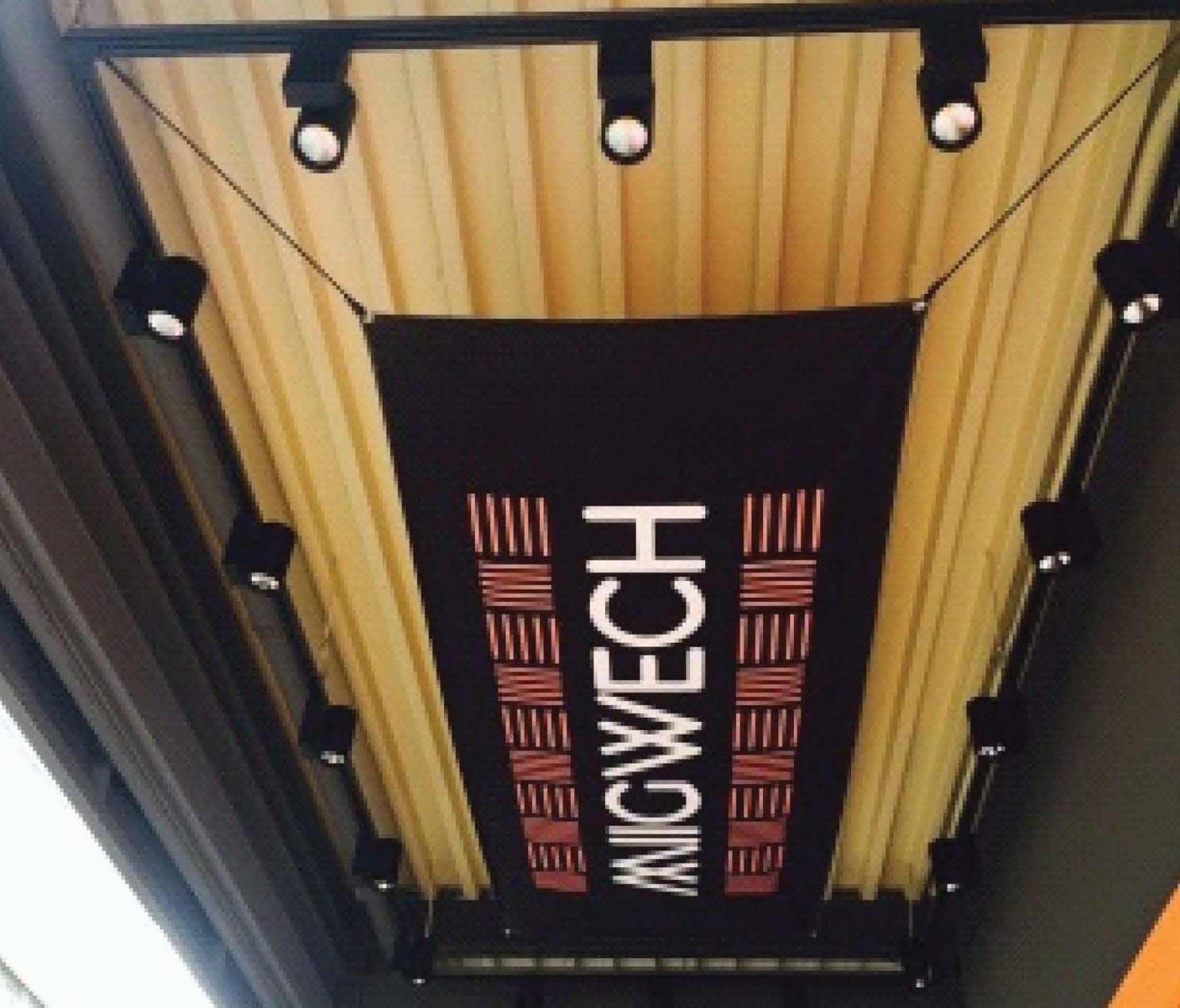
Brand Flag
The large flag installed on the ceiling of the piloti structure is reminiscent of an outdoor activity crew and, at the same time, serves as a visual narrative that hints at the store’s character.
The pattern design applied to the flag abstractly expresses various outdoor activities such as running, jogging, and trekking.
Project Info
This project was completed as part of the Architecture & Design team. Project to expand the company’s own brand, which previously dealt primarily in miscellaneous goods, into a clothing brand, and is a store targeting the modern generation who enjoy sports and activity in their daily lives.
Commercial Project
Completion: May, 2016
Project Type: Commercial Centre & Office
Architects: Ephraim A&D Team
Project Sustainability
- 55% Recycled Materials
- 35% Energy Self-Sufficient
- 20% Less Construction Waste
Other Projects
Case Study I
Oasis in The City
Paju, Cafe Project
Case Study II
Journey in The City
Seoul, Cafe Project
Architecture
Commercial Architecture
– Eco-friend EV charge Centre
– Young Street Mall
– Meditation & Yoga Studio
Let’s Build Something
As a collaborative team member, I will leverage my diverse research perspectives to achieve project solutions that align with the team’s shared values and vision.