
Case Study II
Young Street Mall
Tasked with a project to transform a commercial building located in a downtown area. For many years, the building had been divided into several small shops that many customers did not frequent. The first task was transforming it into a modern, open shopping space. In addition, the task of completing a series of procedures such as building codes, fire safety regulations, and building permits was added as the pilotis space on the second floor was added.
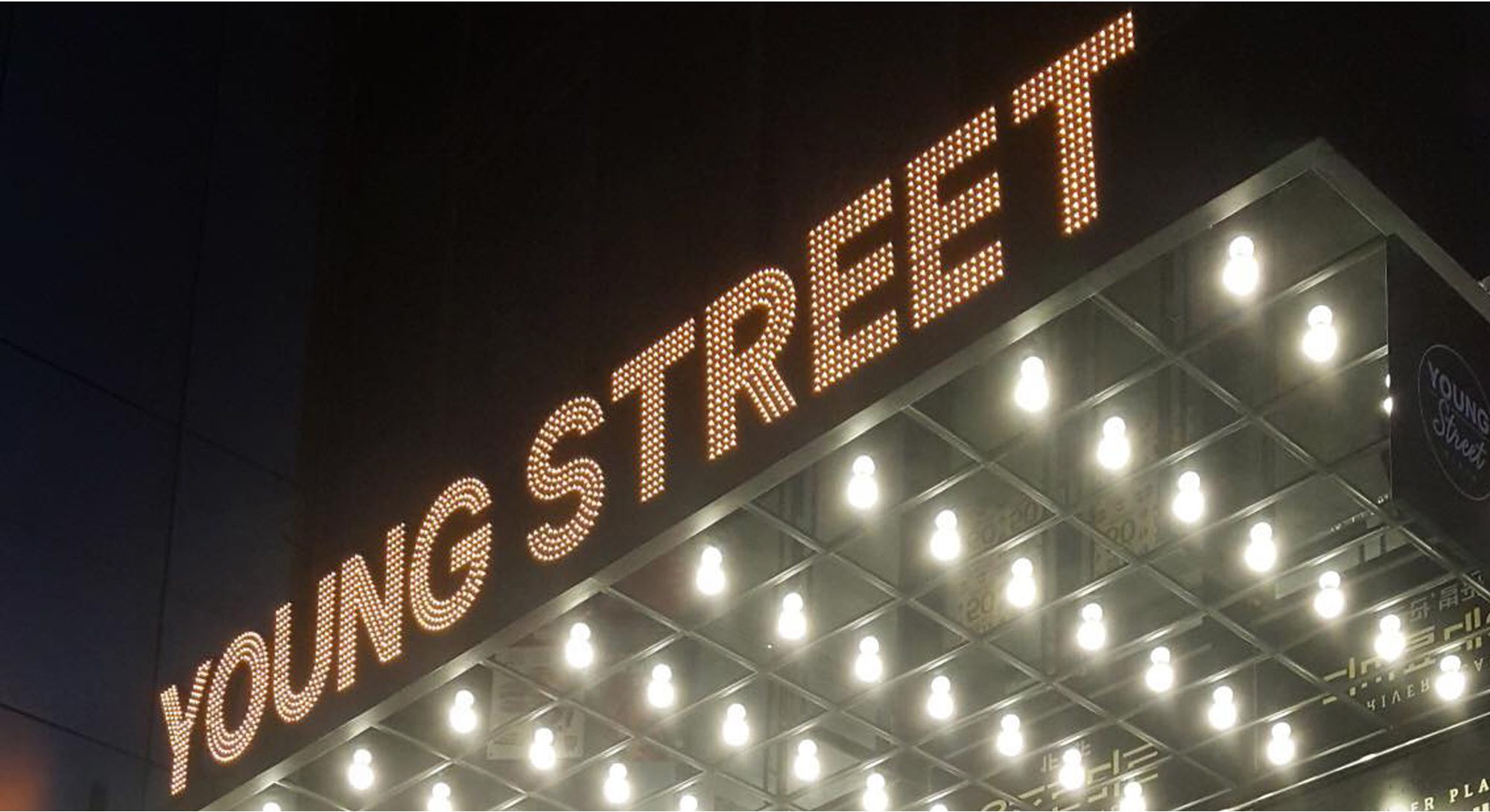
The exterior of the building was also an important consideration. To attract pedestrians’ attention to the neglected building, an eye-catching design was applied to the A and B façades. The ceiling louvre structure and LED lighting were placed patterned, and these design elements were extended to the interior to create a feeling of the interior and exterior being one.
Details
2 Floors, Open Space
2016 / Busan, Korea
Multi-functional Shopping Centre
")
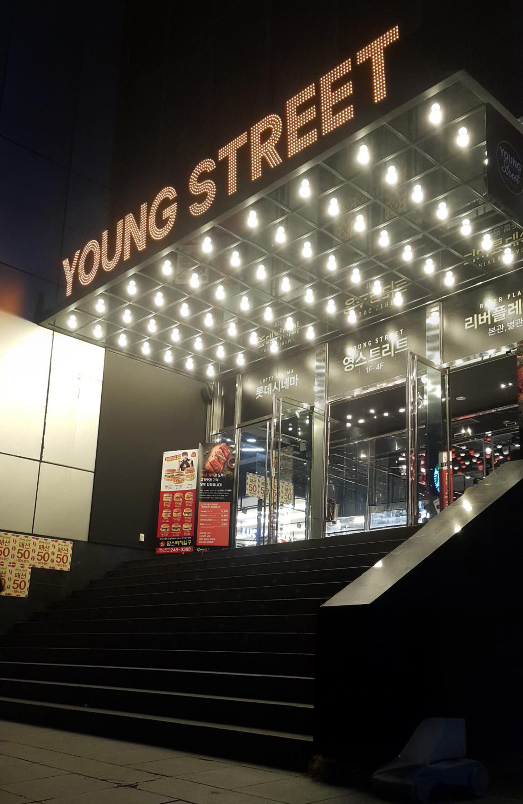
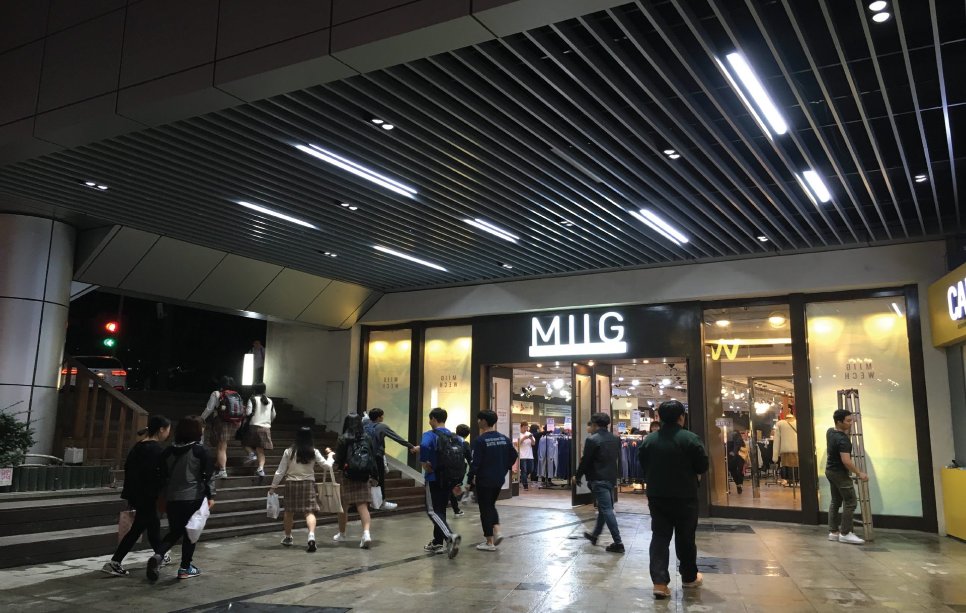
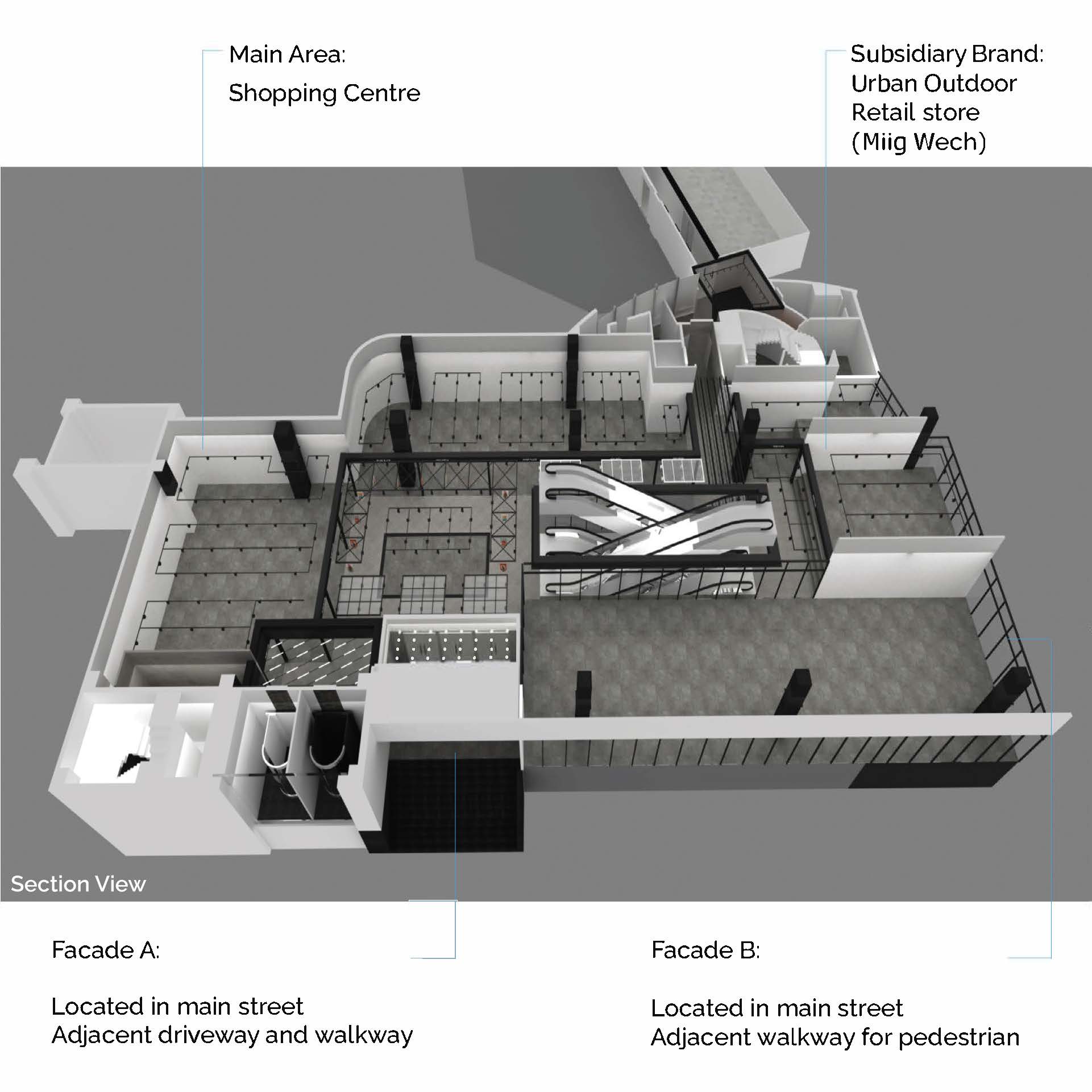
Facade A
As the first entrance to this shopping centre, it is one of the main entrances of the shopping centre connected to the left ramp road. It is located in a lot of visual exposure due to the wide road and river adjacent to it, but it is in a direction where vehicles move more than people walk. Therefore, LED panel signs and LED bulbs, inspired by the opera theatre, were utilized to effectively convey the brand image of the entire building and to show the young image and newly changed appearance of the building at a glance.
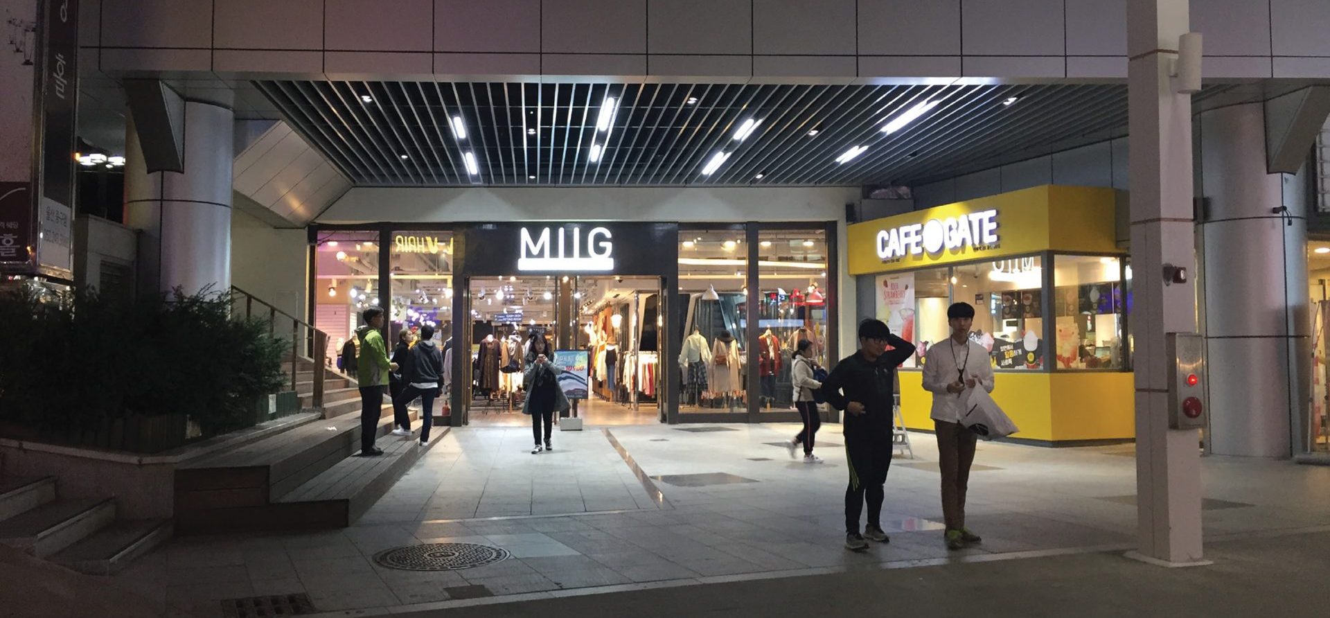
On the other hand, due to the aforementioned locational features, the Facade B area located at the bottom of the slope was considered the main entrance for pedestrians.

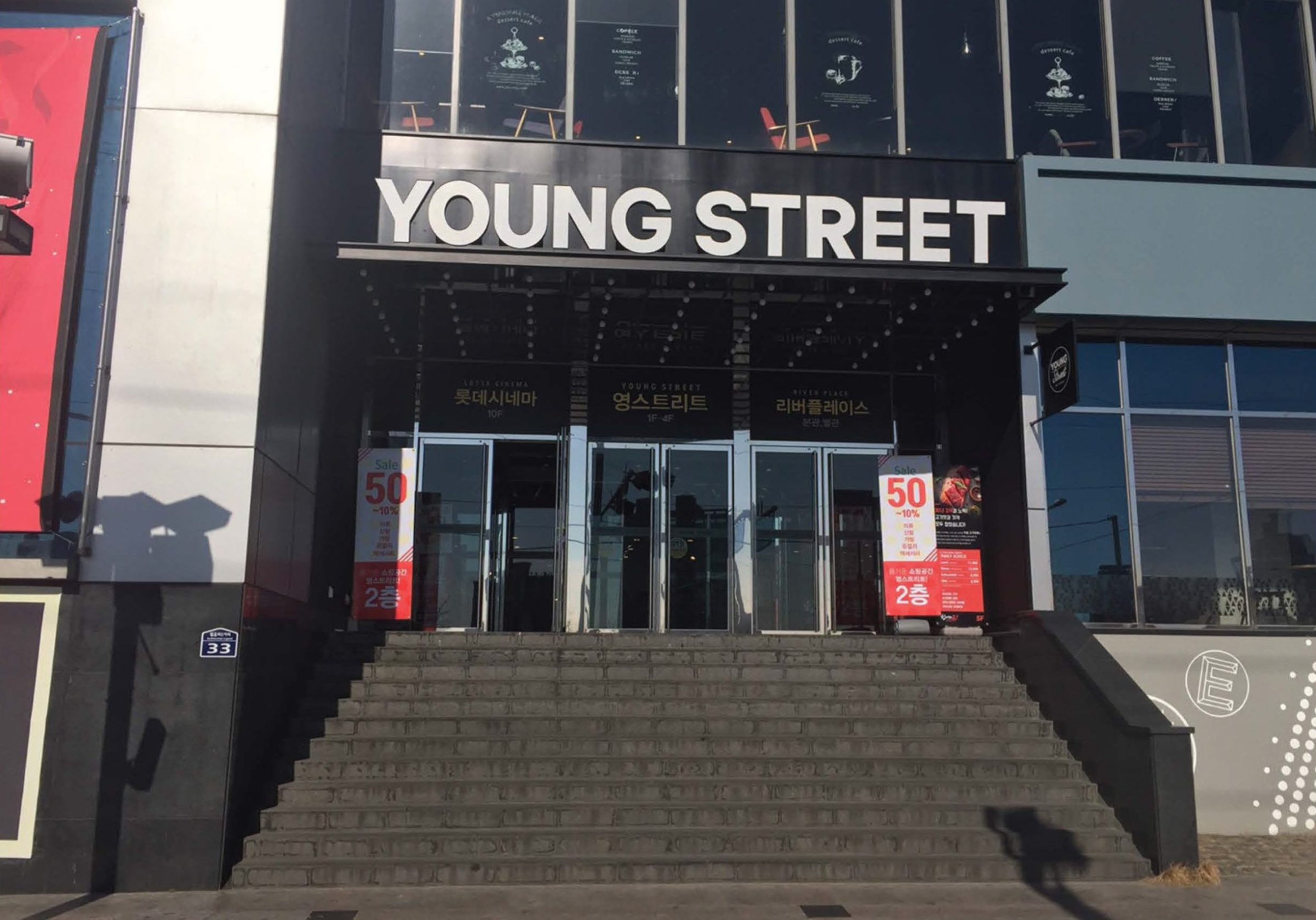
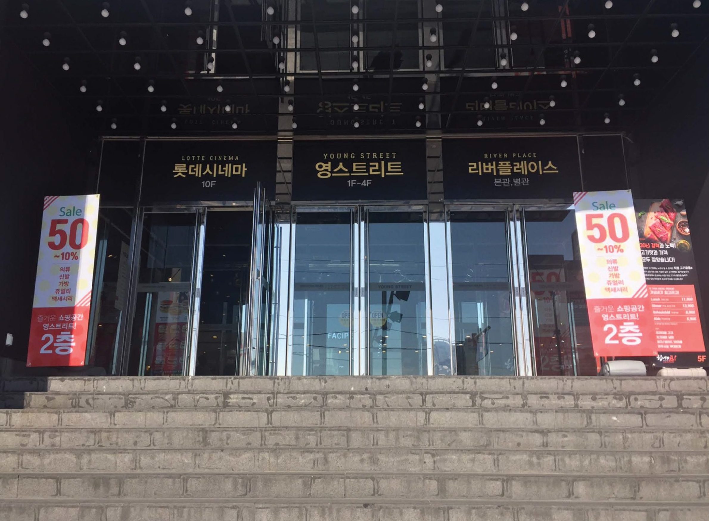
Facade B
Façade B, planned as a pedestrian entrance, was designed to compensate for the lack of natural lighting and dark landscape caused by the lowered ceiling height due to the two-story piloti structure addition and the slope of the adjacent road, which hindered pedestrians from entering the building.
The aluminium louvres and LED bar lights are strategically used as patterns to visually guide the building and effectively guide pedestrians entering the building from the adjacent road. This can be an example of a flexible solution to the building’s unique functional issues and adjacent environmental factors.
Facade Detail
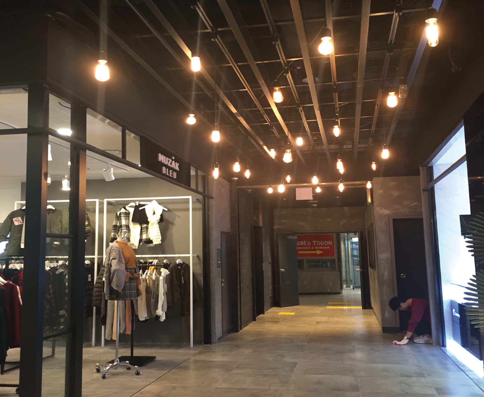
Louver Ceiling with Pattern
To solve the height constraints of the space, aluminium louvre ceilings were adopted for a sophisticated finish while exposing the ceiling as much as possible. Moreover, the louver pattern was applied in a vertical arrangement to clearly recognize the main entrance of the building and induce a natural inflow of pedestrians.
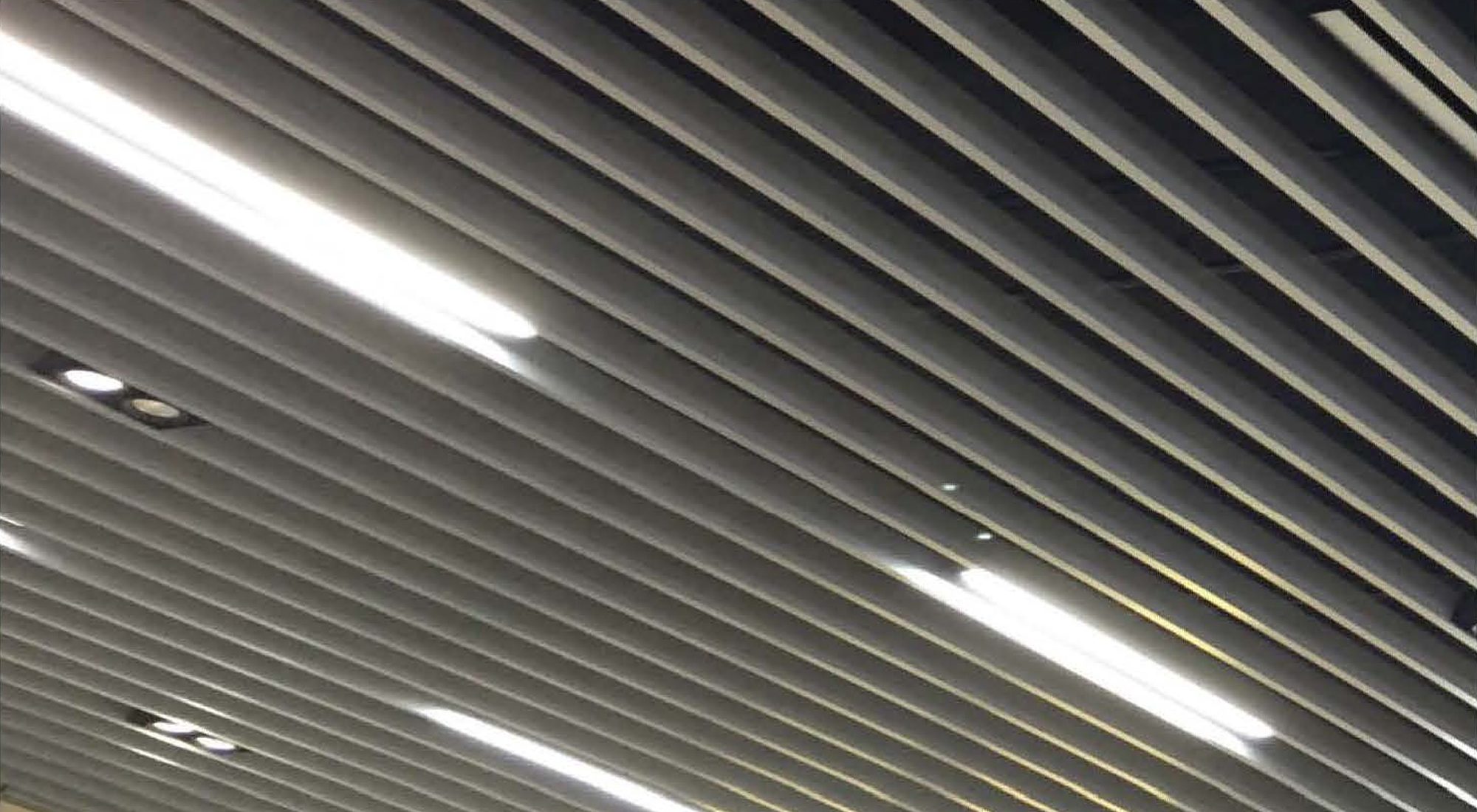
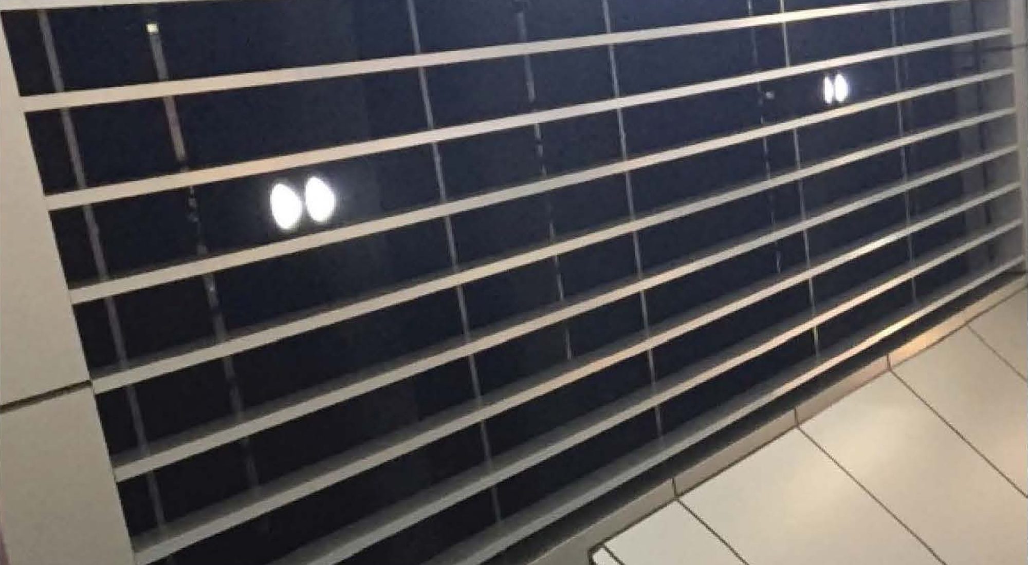
LED Bar & COB Lights
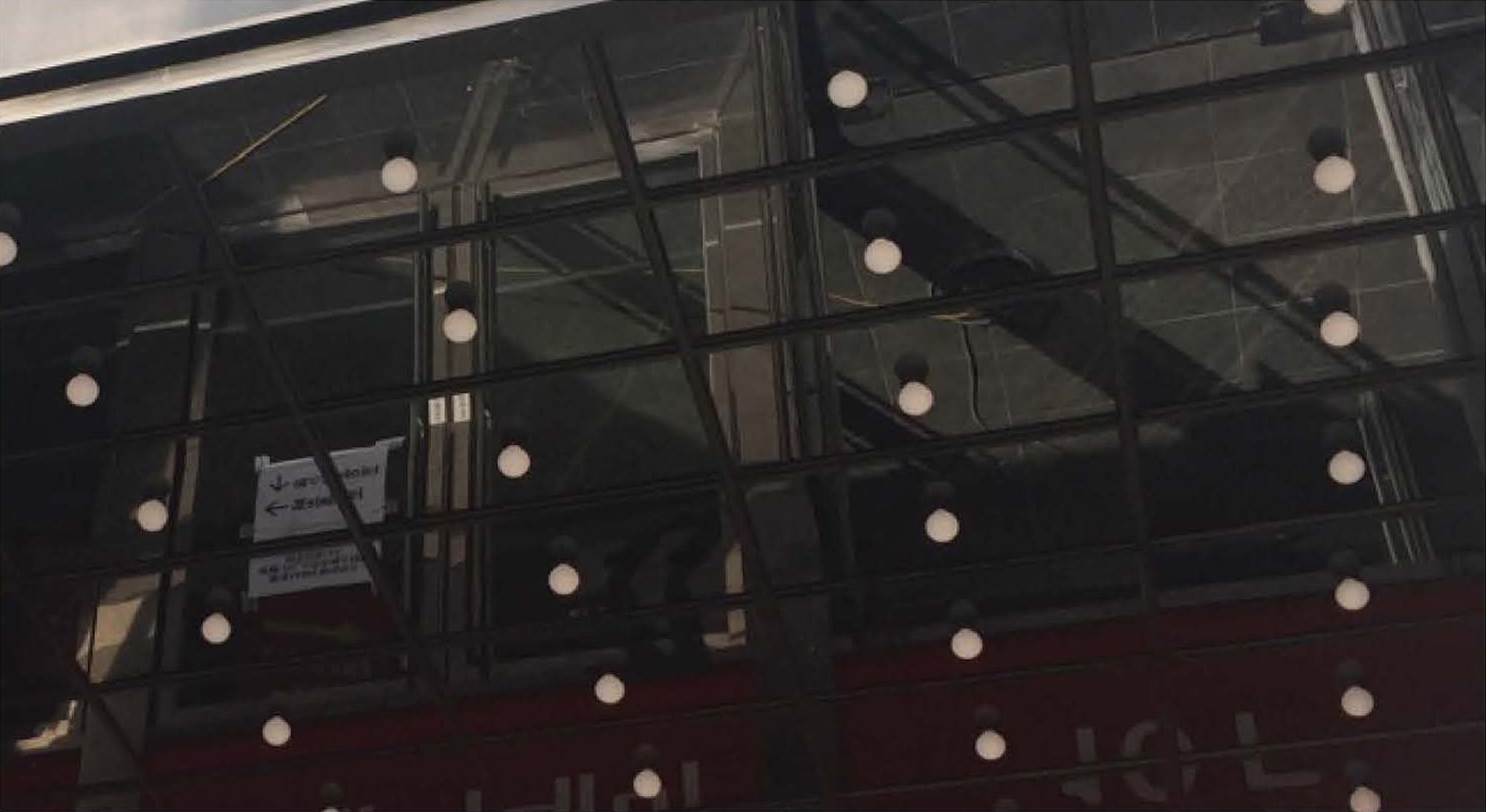
Light Bulbs & Black Mirrors
In order to add a young and dynamic feel to the overall appearance of the building while naturally drawing the visual attention of pedestrians.
In addition, a black mirror was installed on the panel where the LED bulbs will be fixed on the façade ceiling to effectively reflect the bulbs’ light, making the entrance brighter and more vivid.
LED Panel
Since the façade A side is located on a large road and the riverside, it visually emphasizes the presence of a large theatre within the building to pedestrians while projecting the vibrant energy of cultures such as theatres and fashion into the cityscape.
Interior Detail
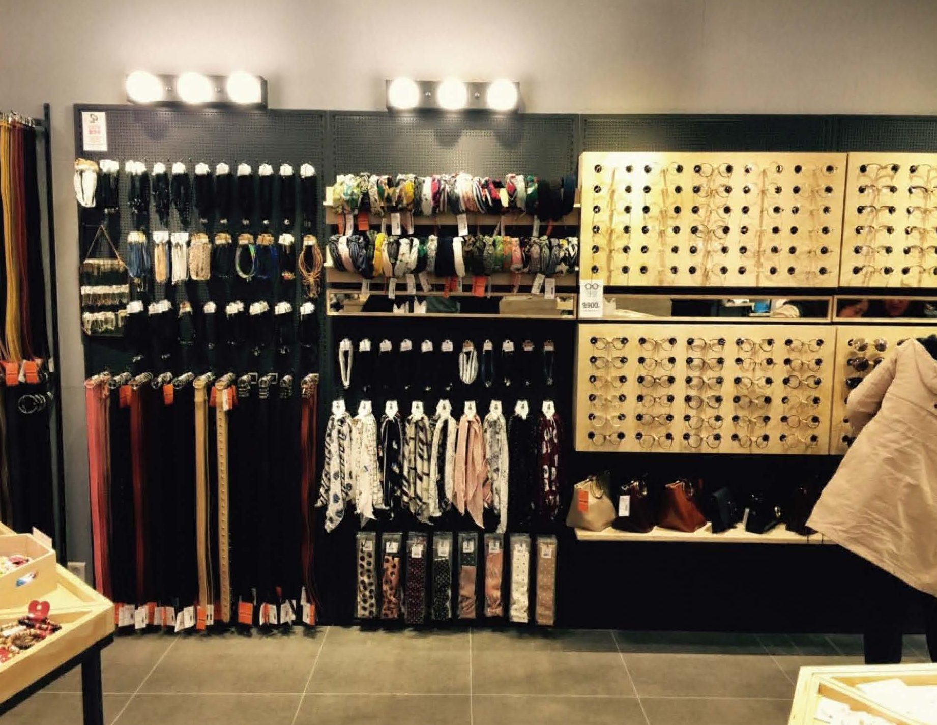
While adopting an open-plan layout, the steel structure was used to effectively divide the space. This was a balanced solution that secured independent work areas for each brand, achieved visual separation, and maintained an overall sense of openness.
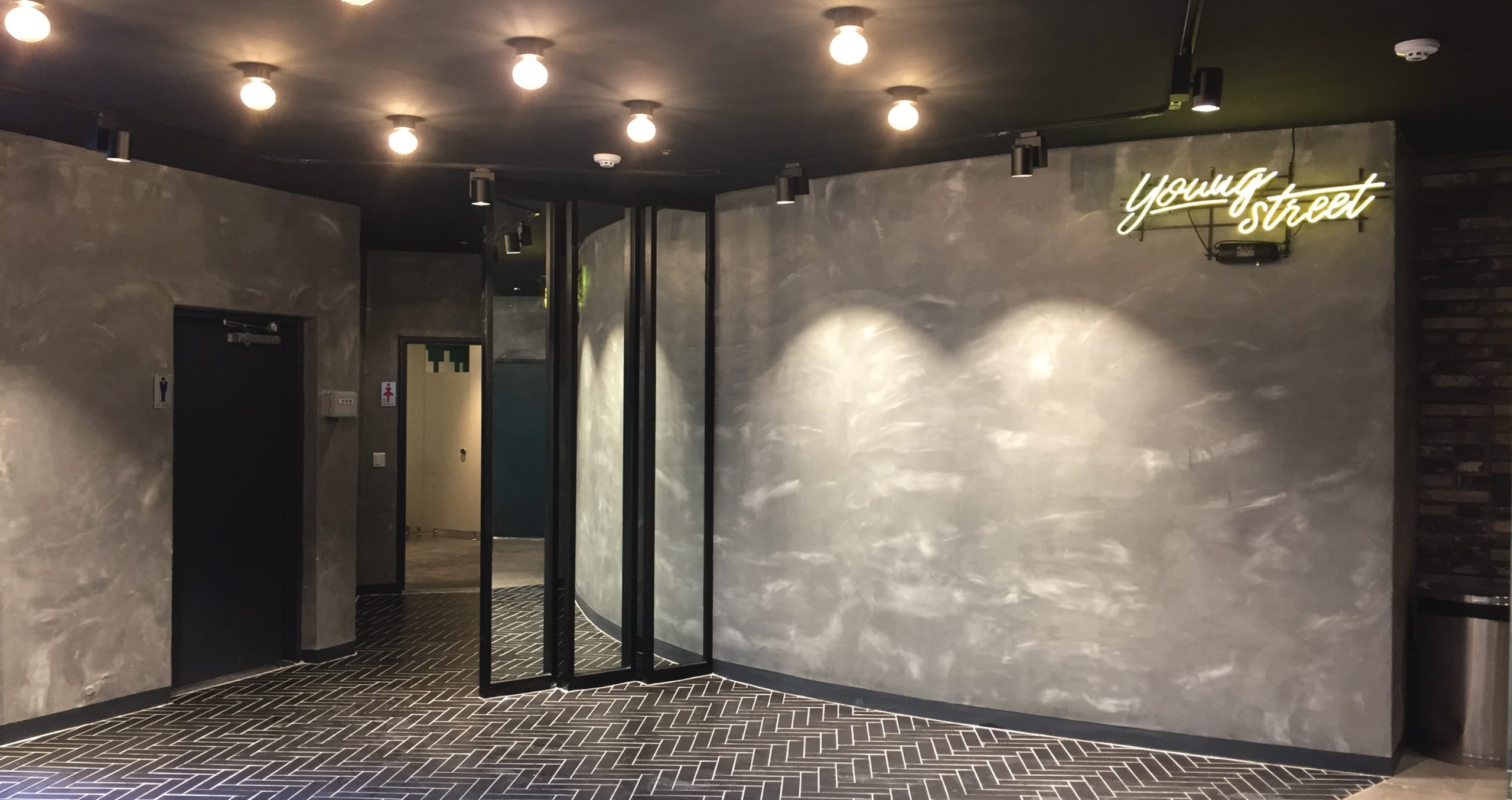
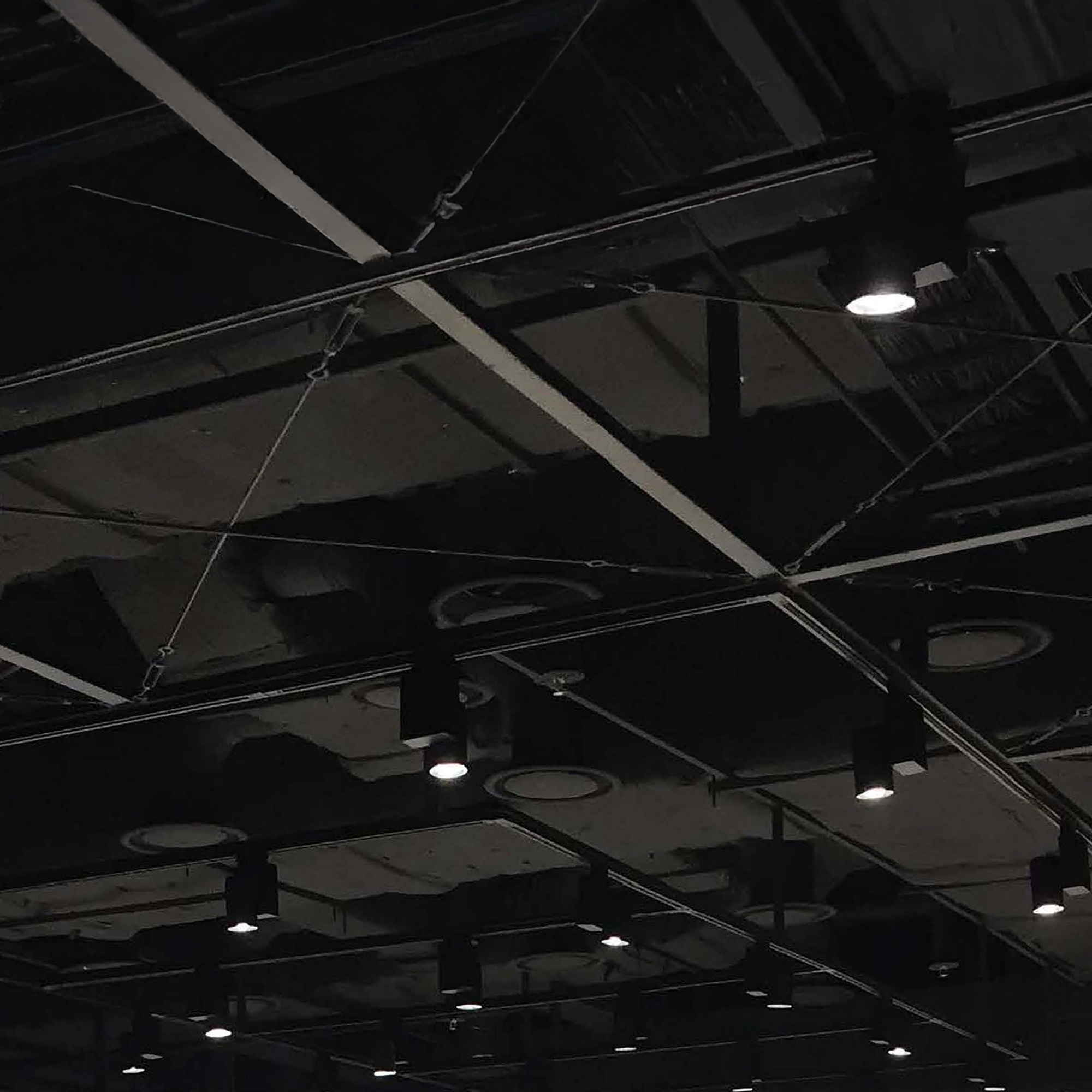
The main challenge of the project was the oppressive atmosphere caused by the low ceiling. To overcome this, all of the plasterboard on the ceiling was removed, but this caused the exposed equipment and structures to cause an aesthetic problem. In response to this new issue, visual unity and a sophisticated atmosphere were created by painting the exposed elements black.
To maximize the sense of space expansion, a steel grid structure and lighting rails were installed on the exposed ceiling. This system allowed for flexible placement of various lights, such as LED bars and bulbs, creating a highly adaptable environment where lighting can be easily adjusted according to the purpose and atmosphere of the space.
")
")

")
")
Section Detail
The inner wall that separated the existing six stores was removed to create a single large open space. This enabled various brands to be introduced in the form of a shop-in-shop and greatly improved the flexibility and openness of the space.
A strategic approach was taken in the expansion and expansion of the piloti structure adjacent to the B side of the second-floor façade, considering the limited ceiling height and narrow area due to the slab expansion. Instead of introducing external brands, the company placed a specialized miscellaneous goods store of the company’s fashion brand, Miig Wech, maximizing space utilization and strengthening the brand identity.
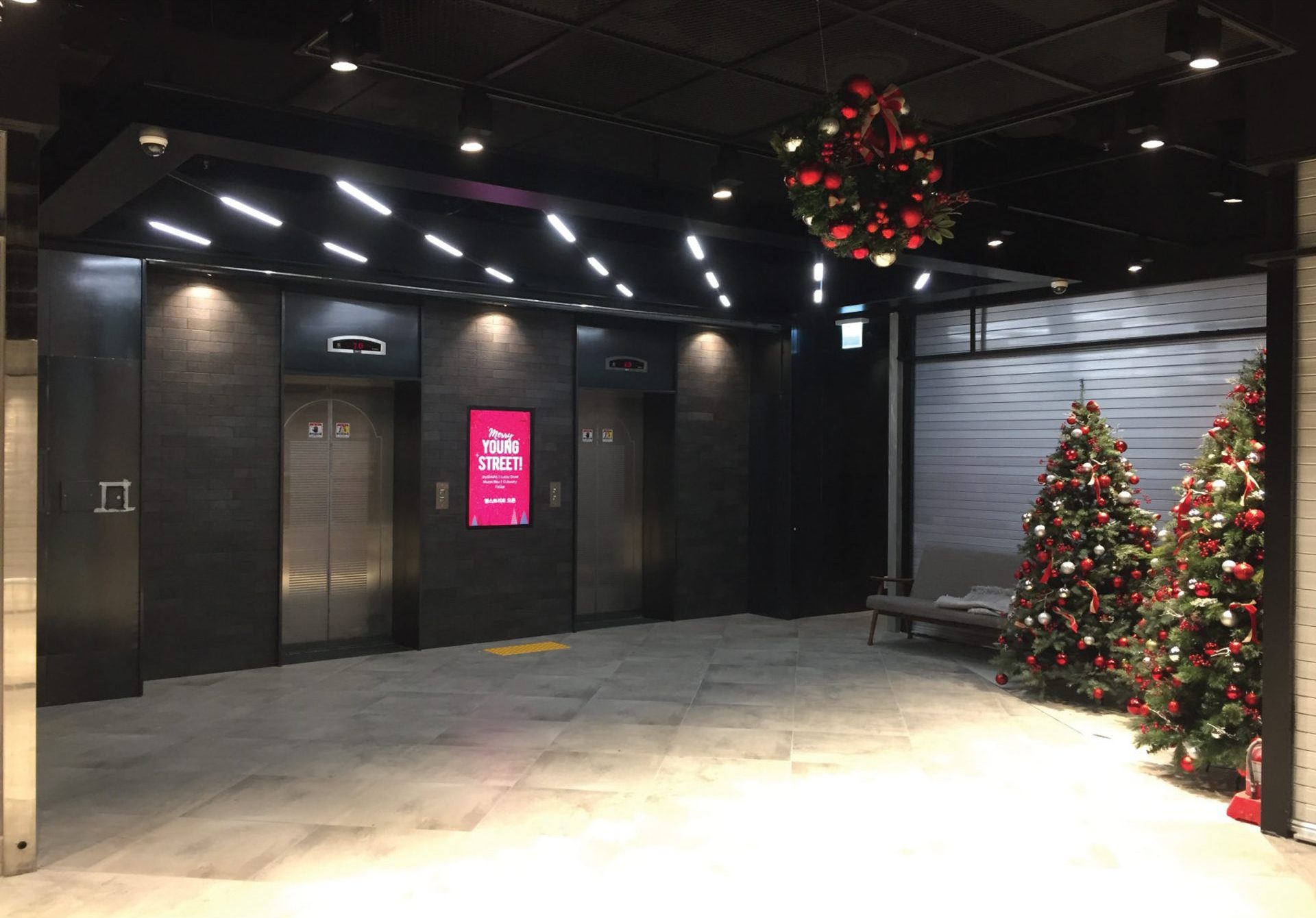
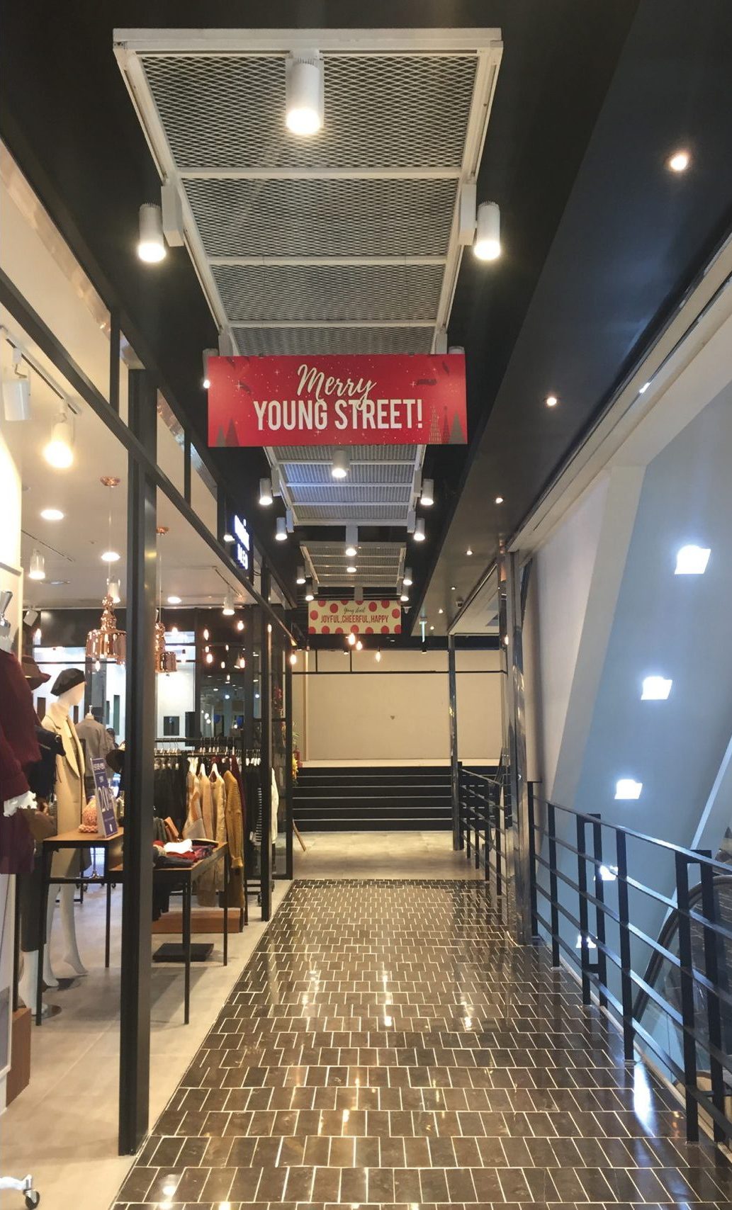
The atmosphere of the space can be quickly changed depending on the season or event. Hanging flags and decorative elements can be easily installed and replaced on the ceiling structure, and this variability increases the aesthetic value of the space while also maximizing the marketing effect.
Since the project was completed at the end of the year, visual marketing was conducted for the Christmas season. Seasonal decorations and lighting were used to create a warm and festive atmosphere, and this timely spatial presentation was very effective in eliciting positive responses from visitors and attracting customers.

Grid Ceiling
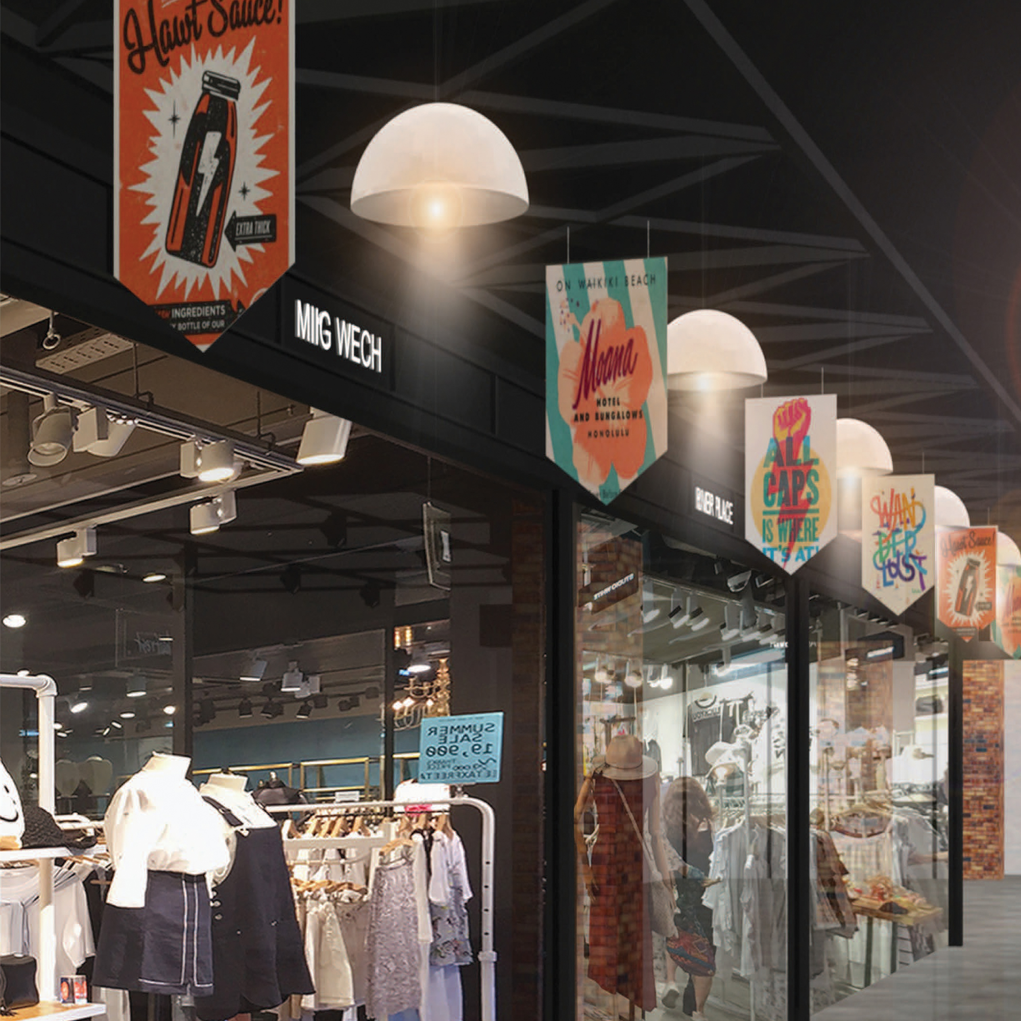
Seasonal Display
This variable design flexibly changes the atmosphere of the space and acts as an effective visual marketing strategy.
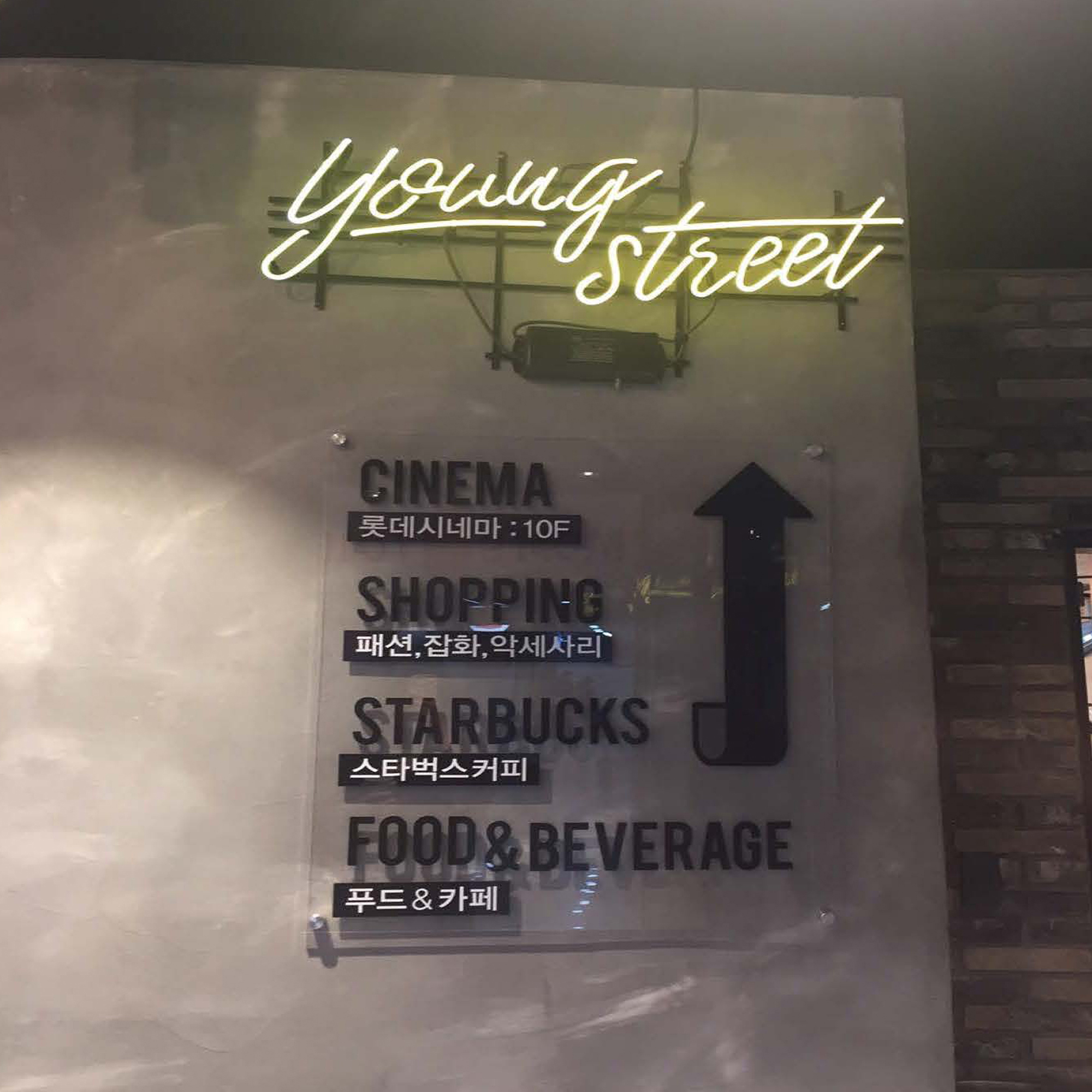
Neon Lights Sign
This gives the space a young and vibrant image while also stimulating customers’ curiosity and making them feel more excited about exploring the space.
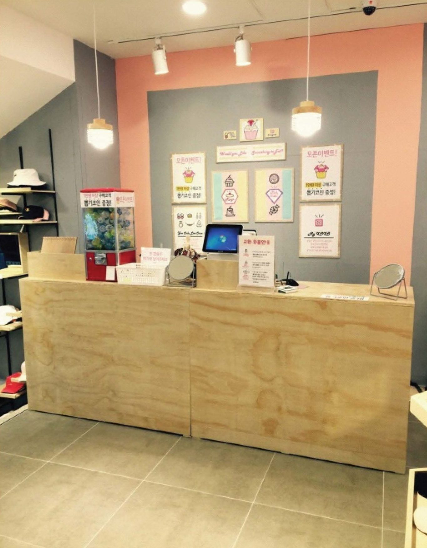
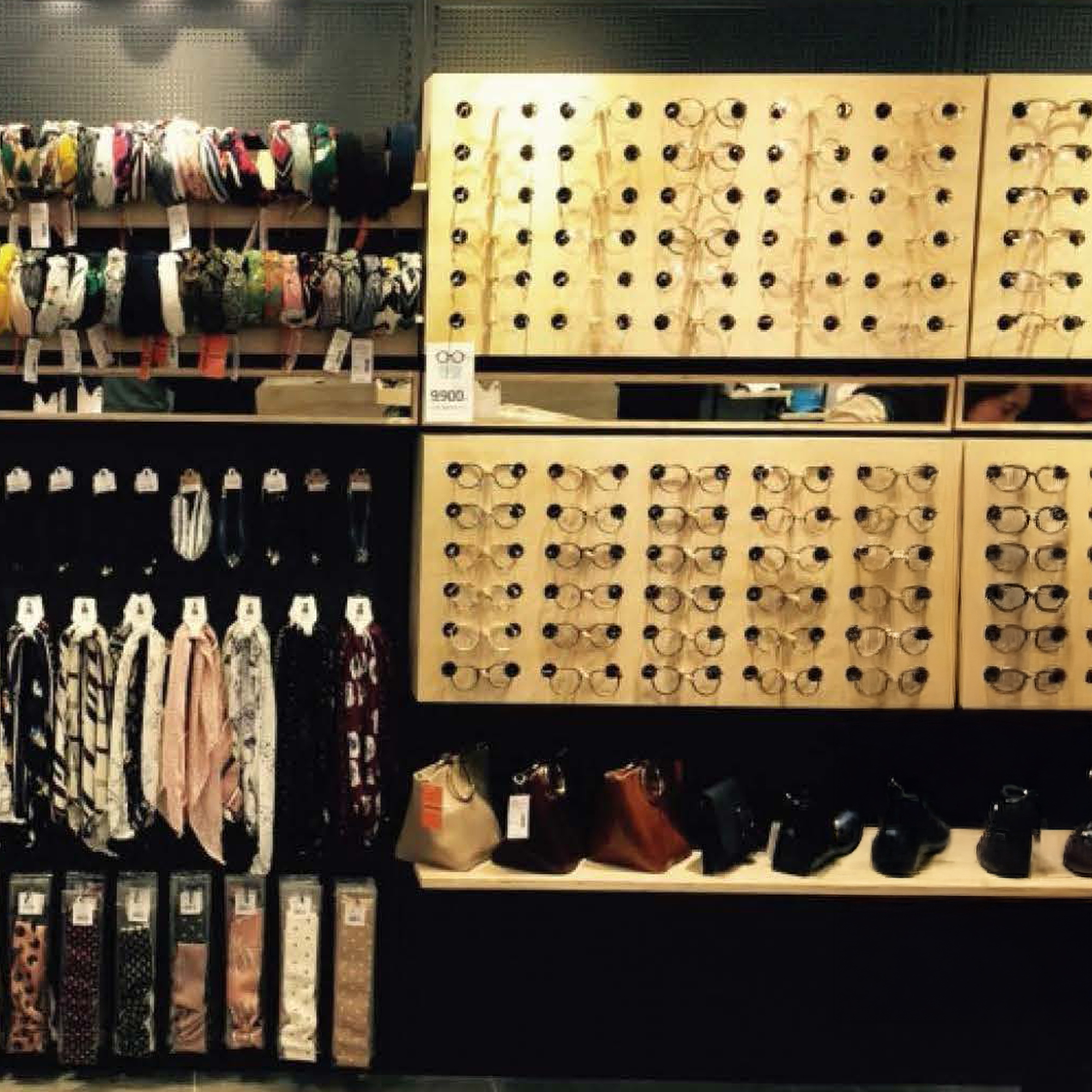
Miig Wech in the Young Street shopping Mall
Planned to utilize the fragmented space with spatial limitations. First of all, our team focused on maximizing revenue by allocating as much space as possible to brand partners. After this process, this area unfortunately remained a piece of space that could not be allocated anywhere due to the reduced ceiling height after the expansion construction.
To overcome the spatial constraints due to the narrow area and maximize its potential, the space was reinterpreted as a niche store specializing in miscellaneous goods for the fashion brand, Miig Wech. Through this approach, a strategic showroom was implemented that efficiently utilized dead space and exposed the brand simultaneously.
")
")


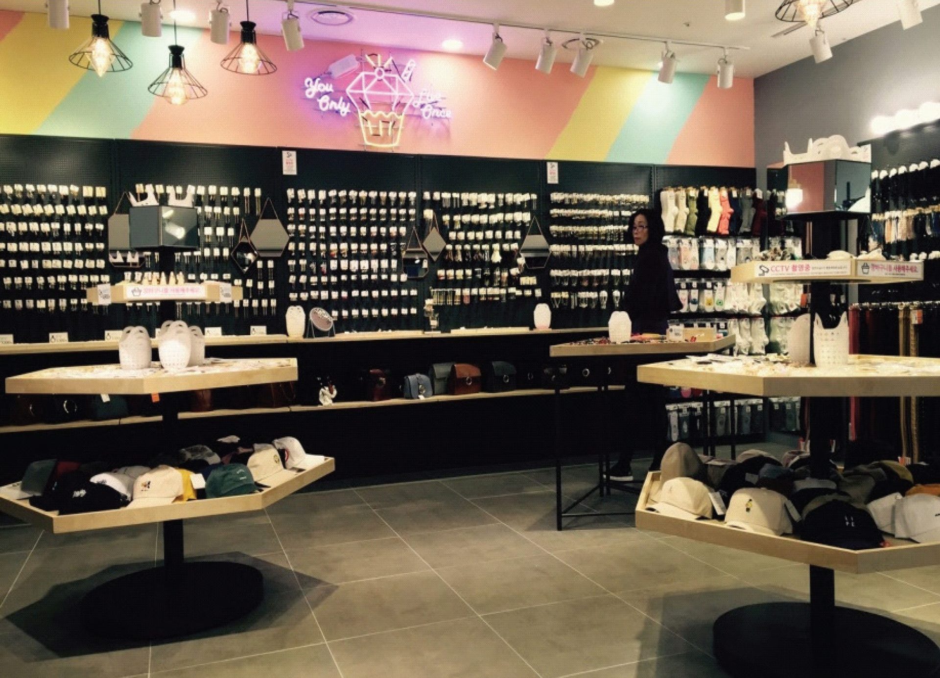
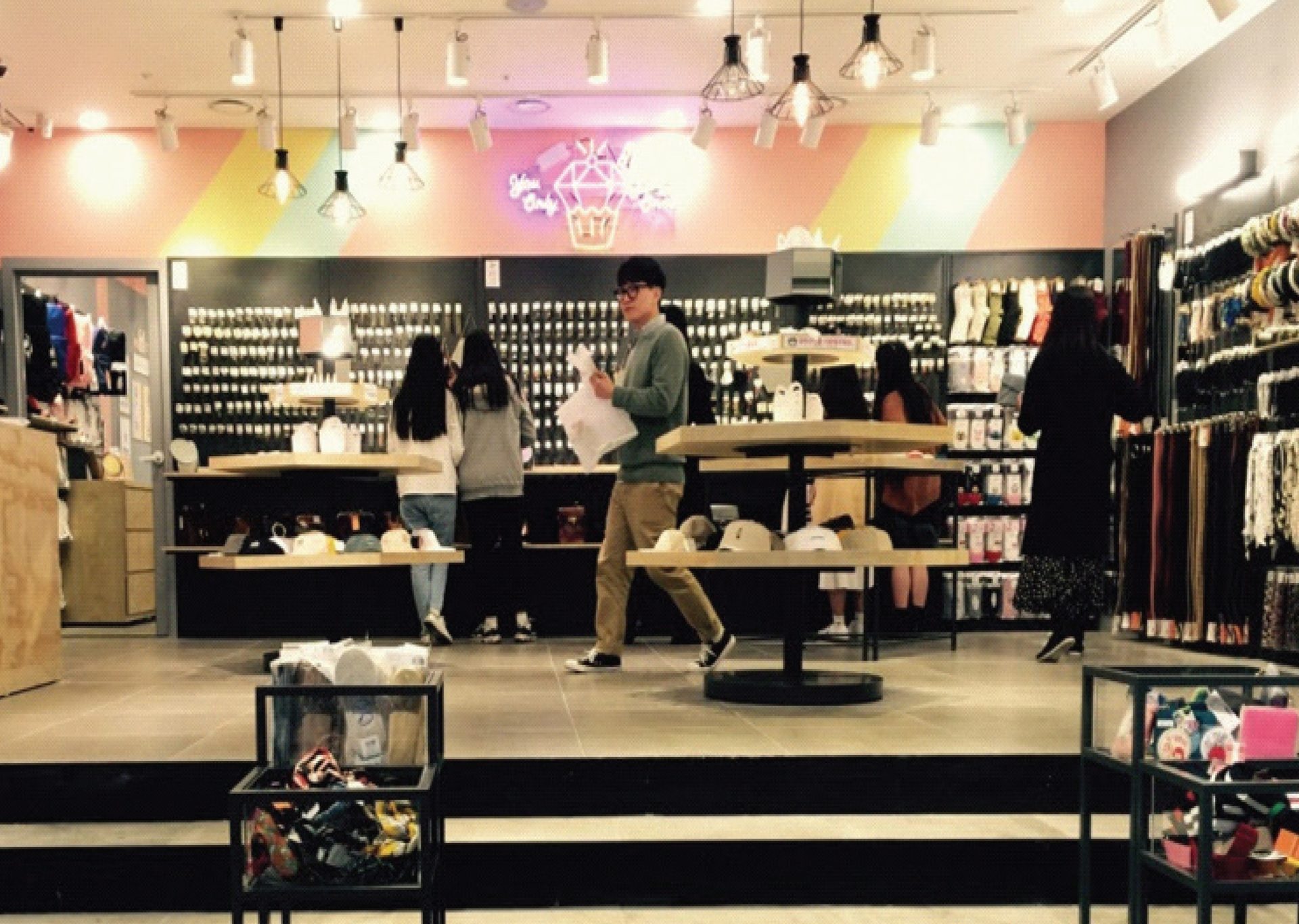
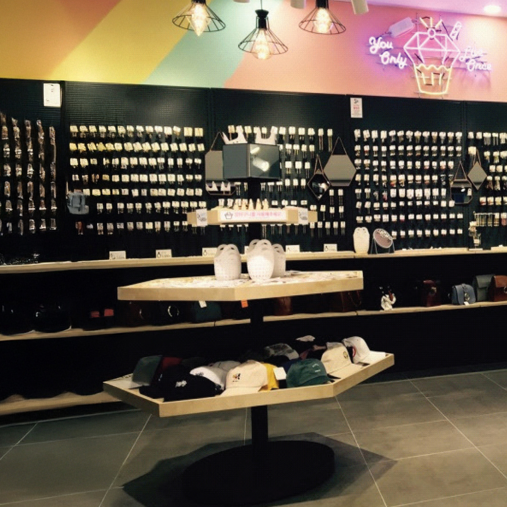
Hexagon Shapes
In particular, a hexagonal mirror was placed at eye level so that customers could conveniently try on accessories such as hats and earrings without moving to a separate wall mirror.
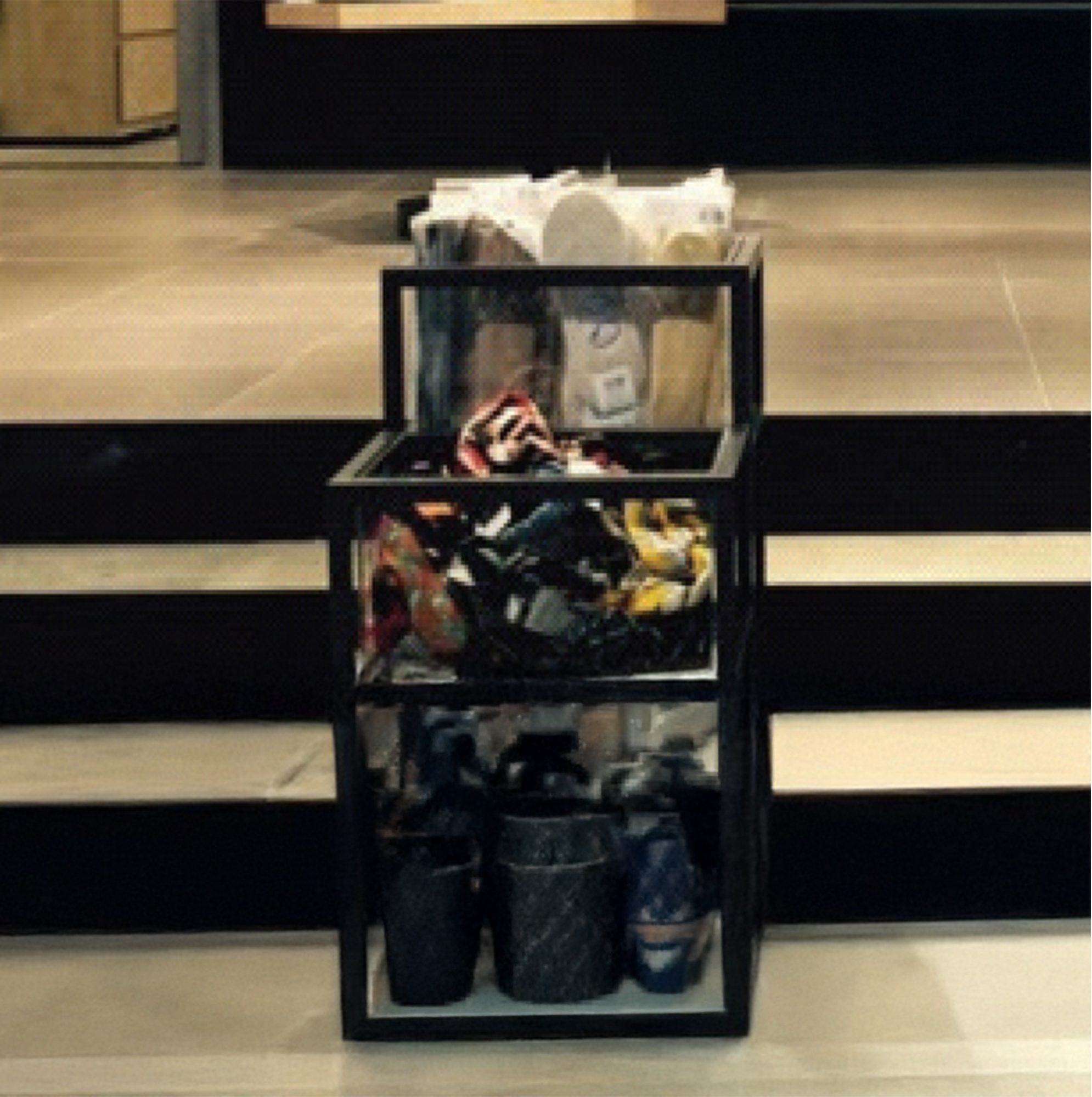
Stepped Display Box
Perforation Display
Project Info
This project was a complex task carried out as part of the Architecture & Design team. Unlike previous single projects, this was a challenging task that involved designing two exterior façades and constructing an extension simultaneously.
This process required efficient time management and prioritization skills, which helped me to take my design capabilities to the next level.
Commercial Project
Completion: November, 2016
Project Type: Commercial Fashion Mall
Architects: Ephraim A&D Team
Project Sustainability
- 65% Recycled Materials
- 40% Energy Self-Sufficient
- 20% Less Construction Waste
Other Projects
commercial
Volkswagen Dealership Centre
Vaughan, Canada
Eco-friend EV charge Centre
Commercial
Meditation Yoga Studio
Toronto, Canada
Sustainable Health House
Interior
Cafe & Retail Interior
-The Gate Cafe, “Oasis in The City”
-The Gate Cafe, “Journey in The City”
-Miig, Urban Active-wear Retail Shop