
Case Study
Seogwang Beach Resort
The ‘Seogwang’ water leisure resort project, which seeks harmony between nature and architecture, is an innovative design case that makes the most of Korea’s unique geographical characteristics. This project demonstrates a challenging attempt to deeply understand the topographical characteristics of the Korean Peninsula and to fuse them with modern architectural design.
By establishing the grandeur of the Taebaek Mountains as the central axis of Korean topography, the design sought to create a harmonious dialogue between the vast scale of nature and architecture. This approach was a process of reinterpreting Korea’s geographical identity in architectural language rather than simply pursuing visual beauty.
Details
Eco-Friendly Resolt
2015 / Taebaek, Korea
Urban Planning Project
")
“Harmony”
The horizontally repeated images applied to the exterior design of the building symbolically represent the continuous ridges of the Taebaek Mountains, projecting the rhythm of nature onto the building. In addition, these repeated patterns are intended to reinterpret the layered structures seen in traditional Korean architecture in a modern way. Through this design strategy, the high and majestic image of the Taebaek Mountains is presented, while the building naturally blends in with the surrounding natural environment.
The ‘Seogwang’ project has become an innovative case that goes beyond the simple construction of a resort and realizes the harmonious fusion of Korean nature, culture, and modern architecture. It presents a new architectural paradigm that respects the geographical characteristics of the region while also combining modern functionality and aesthetics in a balanced way.
")
")
")
The interior space and 2D design were divided into four concepts: eco-friendly, sports leisure, family zone, and conference centre, and facilities and shops were placed according to the characteristics of each area. Through this, the goal was to realize a leisure space where nature, architecture, and user experience are harmoniously combined.


")
Sign & Marketing
A brand identity was developed based on purple hues and refreshing ocean colours inspired by the sunset at the beach. This brand logo became the overall visual element of the resort and was consistently applied to external facilities such as resort signage, kiosks, and shuttle buses, as well as internal amenities.
This design approach further emphasizes the unique atmosphere of the resort and provides visitors with a special sense of belonging and unity. Each element has been designed to harmonize with the resort’s natural environment, ensuring that the customer experience is perfectly connected to the brand image. This design strategy goes beyond simple visual elements and plays an important role in forming an emotional bond between the customer and the brand.
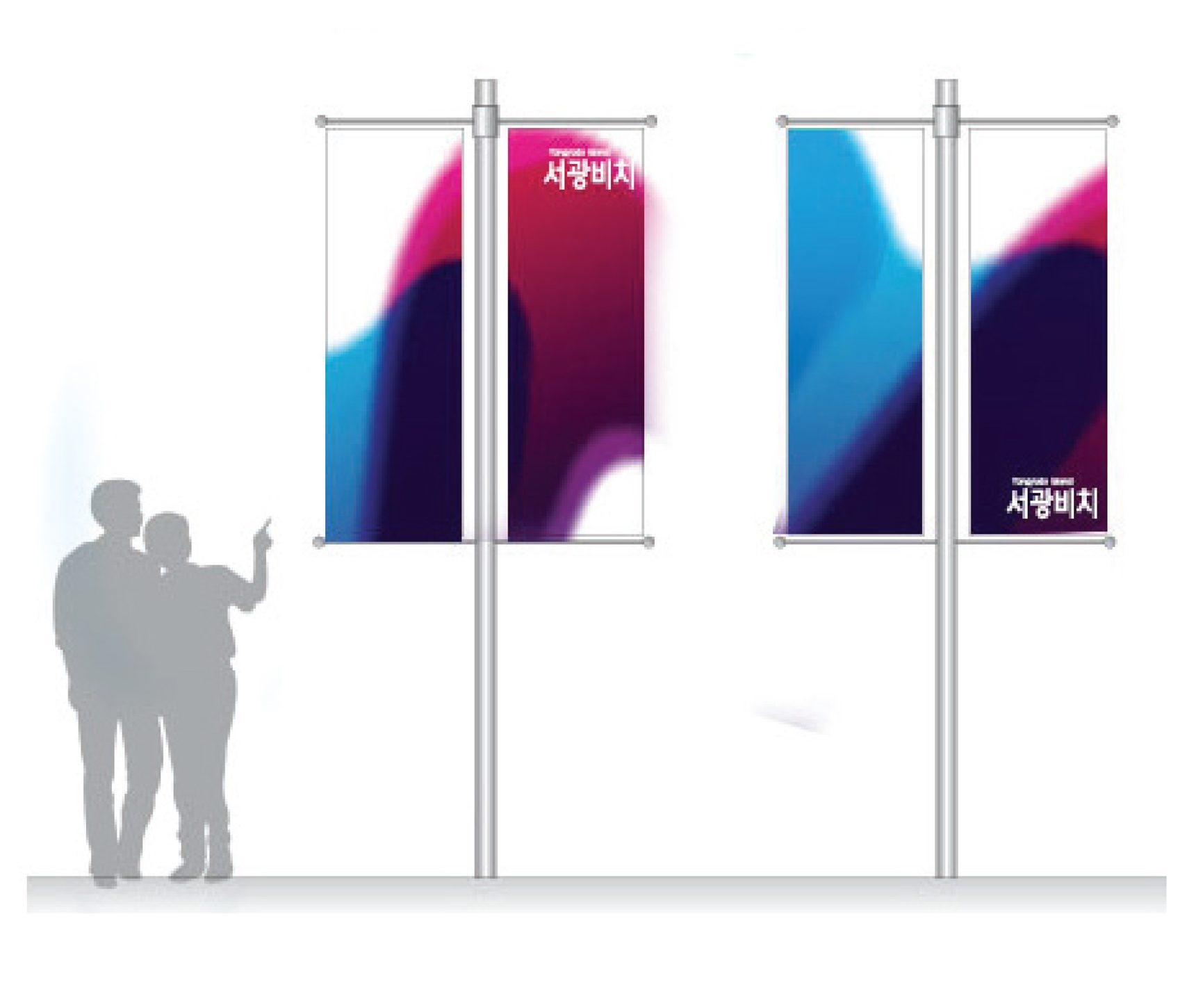
Flag Detail
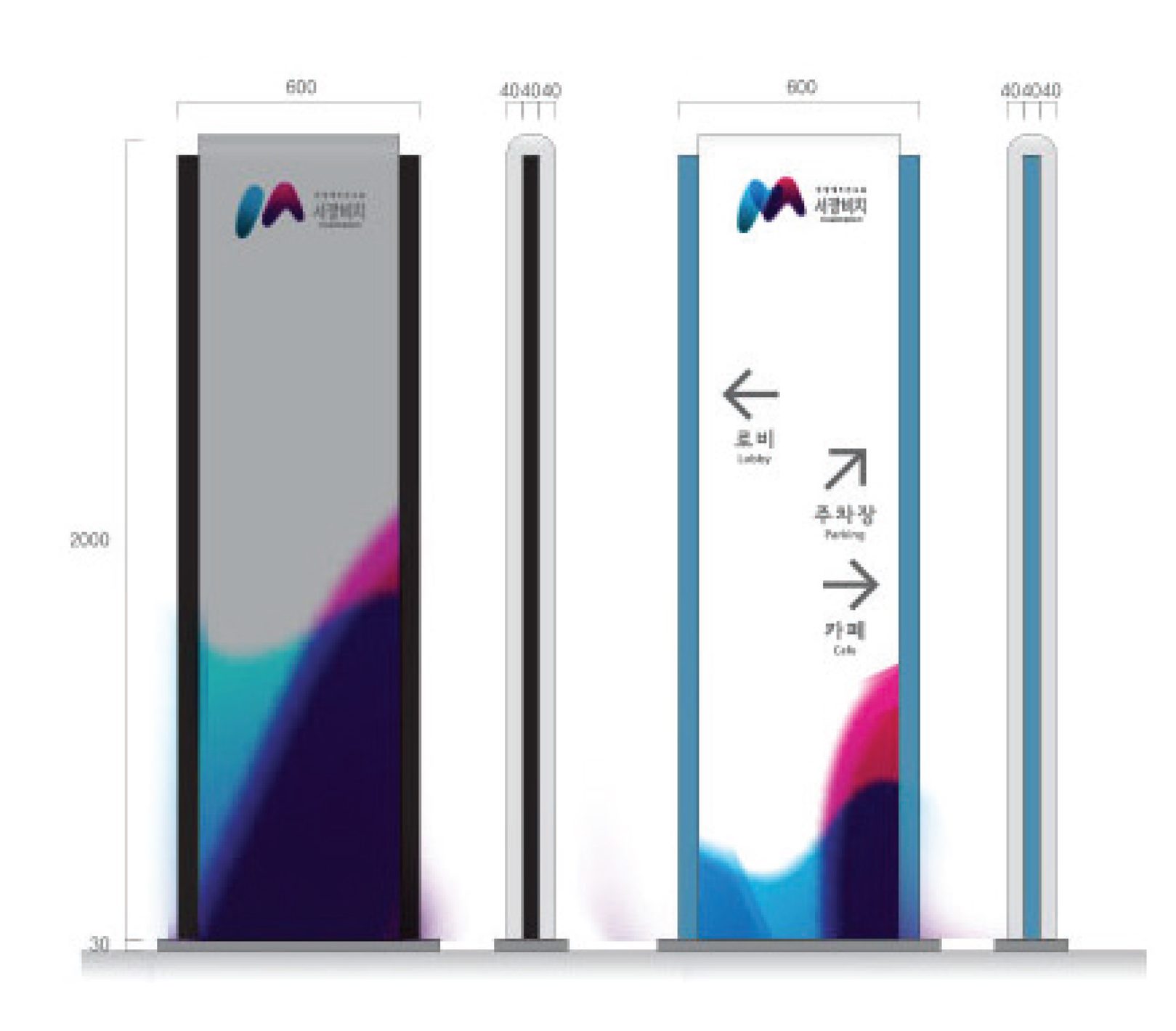
Public Sign
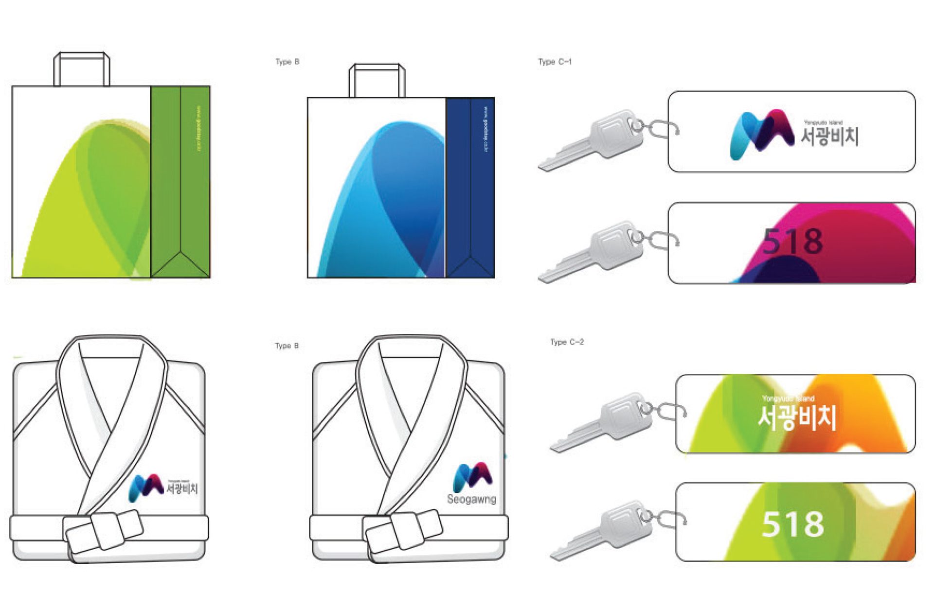
Amenity Detail

Shuttle Bus Detail A

Shuttle Bus Detail B
Project Info
This project is a case study conducted as part of the Bachelor of Industrial Design program, and proposed a city-scale environmental design that maximizes the function of the site and creates a new image by applying the principles of sustainable urban design.
Academic Project
Completion: November, 2015
Project Type: Urban Planning & Landscaping
Architects: Jin Choi, Soomin Park, Eunjin Im
Project Sustainability
- 50% Recycled Materials
- 70% Energy Self-Sufficient
- 10% Less Construction Waste
Other Projects
Architecture
Commercial Architecture
– Eco-friend EV charge Centre
– Young Street Mall
– Meditation & Yoga Studio
Interior
Cafe & Retail Interior
-Paju, “Oasis in The City”
-Seoul, “Journey in The City”
-Miig, Urban Active-wear Retail Shop
Furniture
Expect_Light
Lighting Fixture
System Module Light